A case study in eight parts, containing five photographs, four drafts, two recordings and one gesture.
Greg McCarthy, 2026
Rafa & Nicky
An editorial photography duo needed a portfolio that reads like a magazine, not a template. This page is the record of its design and build — the visual system, the motion and the front end — organised around one idea: get out of the photography's way.
§ 01 / 08
The project
The duo arrived with a strong point of view and almost no infrastructure around it. The site had to carry them from first commissions towards campaign work: editorial and considered, easy to grow, anchored by their hand-drawn signature — and built so that neither they nor a future collaborator would ever be locked into me. That last requirement shaped nearly every technical decision that followed.
Three tensions had to be resolved at once.
three tensions, three rules — each sits nearer the word that won
The photography needed room to breathe, yet a site that is only a grid of images is forgettable. A bespoke, motion-rich site is usually the least maintainable kind. And the budget was lean while the site had to look at home beside photographers two tiers ahead. Every decision on this page answers to one of those three rows.
§ 02 / 08
Direction & research
The direction came from the photographs themselves and a reference pass through editorial fashion sites, galleries and museums. The throughline: typographic restraint plus one signature gesture — borrow the confidence of a gallery wall, then add a single human mark.
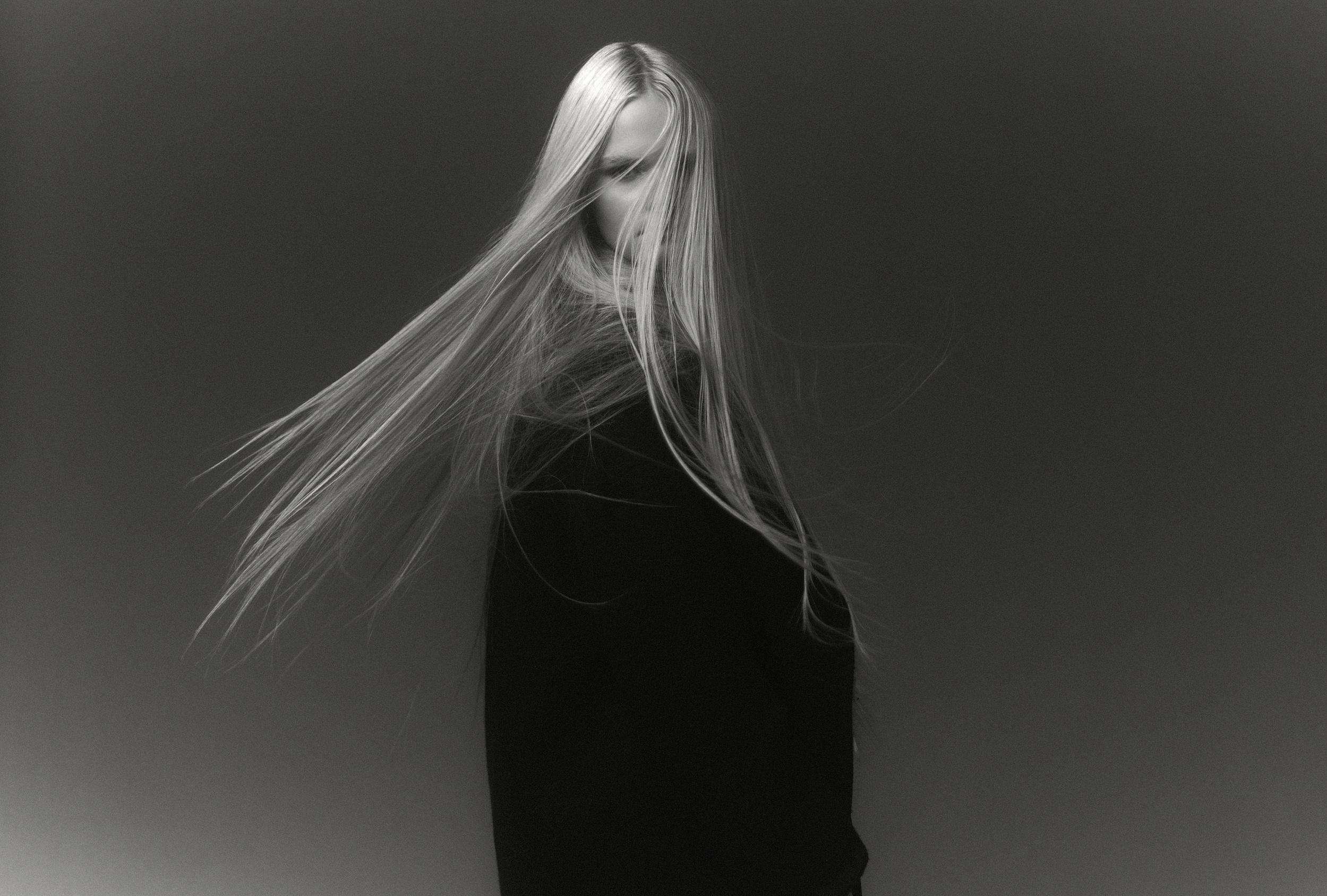
fig. 01 — blend-strip-1.jpg, 2499 × 1688 px, photograph, 2026
To keep every decision grounded in who the site is for, six audiences were mapped and ranked. The ranking is the point: the site is built for the realistic near-term win, not the dream client it cannot land yet. Each audience is distilled to the question it arrives with.
- 01Photo editor / art director"Three days to fill a slot and twelve portfolios open."primary target
- 02Creative collaborator"Is this someone I want my name next to?"high leverage now
- 03Brand or agency creative director"I need to feel safe putting this in front of the client."aspirational
- 04Modelling agency and talent"Worth sending our talent to?"the network
- 05Press, curator, gallery"A bio, a statement and selects — fast."cheap prestige
- 06Peer photographer"How did they get that look?"audience, not client
One insight from that work shaped the entire site. An early-career book cannot lean on big logos or stacks of tearsheets; the job is to make a lean résumé read as inevitable talent, and to lower the risk of being someone's first commission.
coral #ff8282 — first and only use
The biggest lever is curation, not volume. Five tight, cohesive projects signal taste; twelve scattered ones signal still-figuring-it-out.
§ 03 / 08
The signature
You have already seen this motion. It opened this page.
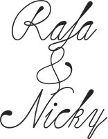
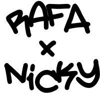
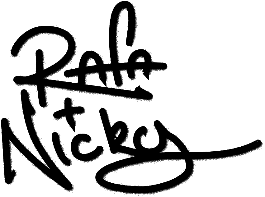
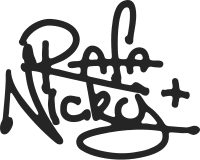
The signature became the brand's anchor — but not on the first pass. It moved through an elegant script, then bolder block explorations, before settling on the final hand-drawn mark: the one that points where the duo want to grow, and carries enough personality that the rest of the interface can stay neutral.
On the site, the landing page opens on that signature, large and centred. On the visitor's first interaction it shrinks into the corner and becomes the navigation logo — one continuous motion, about a second. An intro, not a gate: the mark holds just long enough to register, then hands off to the photography.
§ 04 / 08
The collage
The work is not a paginated grid. It is one continuous collage — overlapping frames scanned across like a gallery wall, looping seamlessly in both directions and drifting gently when left alone. On a phone the same motion turns vertical: a true mirror of the desktop experience, not a watered-down version.

collage-still.png, 4000 × 346 px — the strip at rest
This page's header is painted with the same trick — watch it cross the film.
One craft detail carries the chrome. The mark, the navigation and every interface element are painted white and blended with the page, so a single element reads near-black on paper and flips to white the moment a photograph passes beneath it. No second colour, no manual theming.
rec. 02 — collage-loop.mp4, screen recording, the collage in motion, 10 s loop
Around the collage sits a small, consistent kit — an overlay menu that opens in place rather than navigating away, project pages with staggered editorial galleries and a full-screen lightbox, and an about page — all assembled from the same documented components.
§ 05 / 08
Testing & iteration
two rounds, three changes
The site went through two deliberately lean rounds of user testing — a small handful of participants, enough to catch where the experience and our assumptions diverged. Three decisions changed.
-
round 1 → 2
The signature. Refined how the mark reads and how it behaves as the brand anchor.
script → hand-drawn mark -
round 1 → 2
Mobile navigation. What worked as a horizontal strip on desktop did not feel right under a thumb.
horizontal strip → vertical scroll -
round 1 → 2
Card hover. Tuned what surfaces on hover, and how, so the interaction reads as intentional rather than noisy.
flat tint → oil-slick bloom
Two short sessions were the cheapest way to surface all three — and spared a far more expensive course-correction later.
§ 06 / 08
Locking the system
With the direction settled, the system was formalised in Figma and in code together: a semantic palette on a warm paper ground; a type scale that steps through discrete sizes at each breakpoint rather than scaling fluidly; and accessibility built in, with every text-on-ground pairing tuned to WCAG AA. Three swatches were nudged darker and pushed back into Figma — the source of truth stays accessible too.
- Figma — ground / background
- --paper: #faf9f6
- Figma — text / primary
- --primary-type: #252525
- Figma — accent / default
- --accent: #ff8282
Every value is a live Figma variable with light and dark modes, mirrored one-to-one as a CSS custom property — edit it once and it stays honest on both sides.
The subject's typeface is Space Grotesk. This catalogue is set in the studio's Suisse Int'l — the frame is not the painting.
§ 07 / 08
The handoff
No framework, no build step — the same is true of this page.
The handoff is not a static site someone must reverse-engineer. It is a codebase written so the clients can maintain and grow it themselves, with documentation in plain language that a person — or an AI assistant — can follow to add a project, a page, or a style.
- 01
Drop the photographs and a few lines of copy into a new project folder.
- 02
Templates, shared components and CLAUDE.md do the assembly — no hand-coding.
- 03
Publish. The new project is on the site.
Handoff is a feature.
The entire site is plain HTML, CSS and a little JavaScript — the files open directly in a browser. No package manager to keep current, no toolchain to break, no framework to age out. In five years it still opens. Design tokens act as the contract between Figma and the code, and the documentation was written alongside the build, not after it.
§ 08 / 08
Outcome & reflections
The duo get a portfolio that looks the part — image-first, editorial, memorable in exactly one place — and a site they own outright rather than a deliverable maintained through me. It stands today as a working prototype, built not as a clickable mockup but as the real, deployable thing, and launches in August 2026.
- 8.1
Sketch it before you build it. Working the system out on paper and in Figma first meant the build realised decisions instead of making them.
- 8.2
One gesture beats ten. The personality budget was spent in a single place, so everything else stays calm and the work leads.
- 8.3
Pitch the craft at where the client is going. Built for the duo they are becoming, not the stage they are at.
- 8.4
Handoff is a feature. A project the client owns outright is a more honest kind of value than a retainer they never asked for.
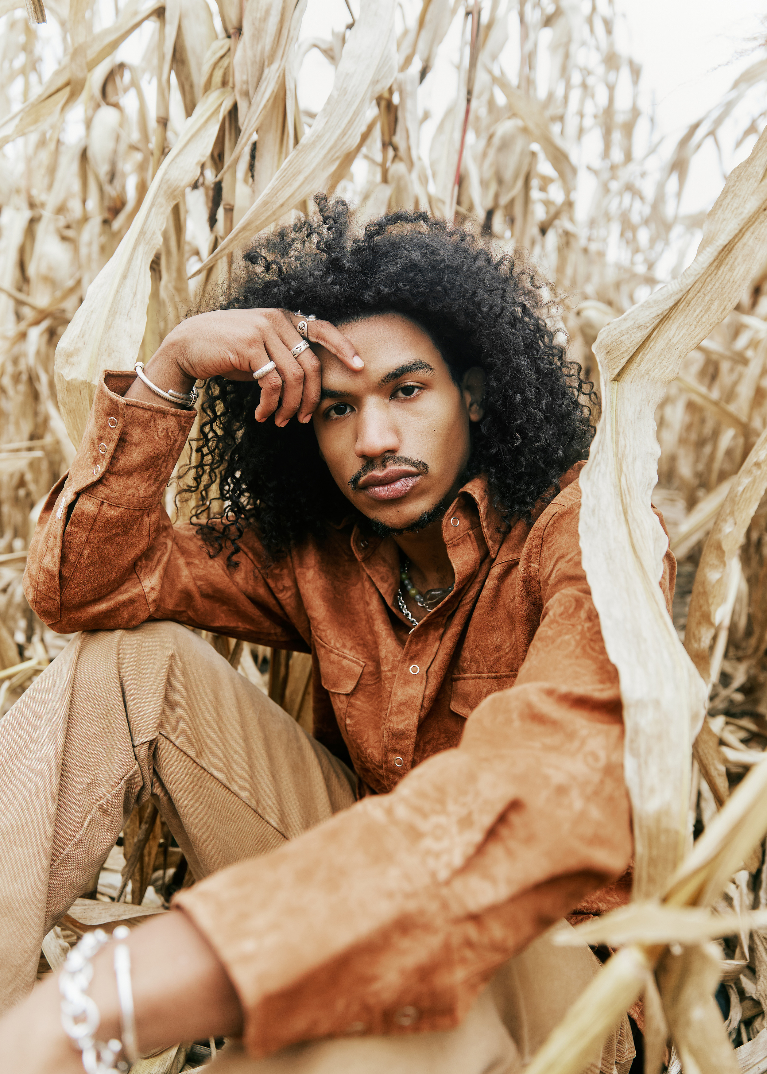
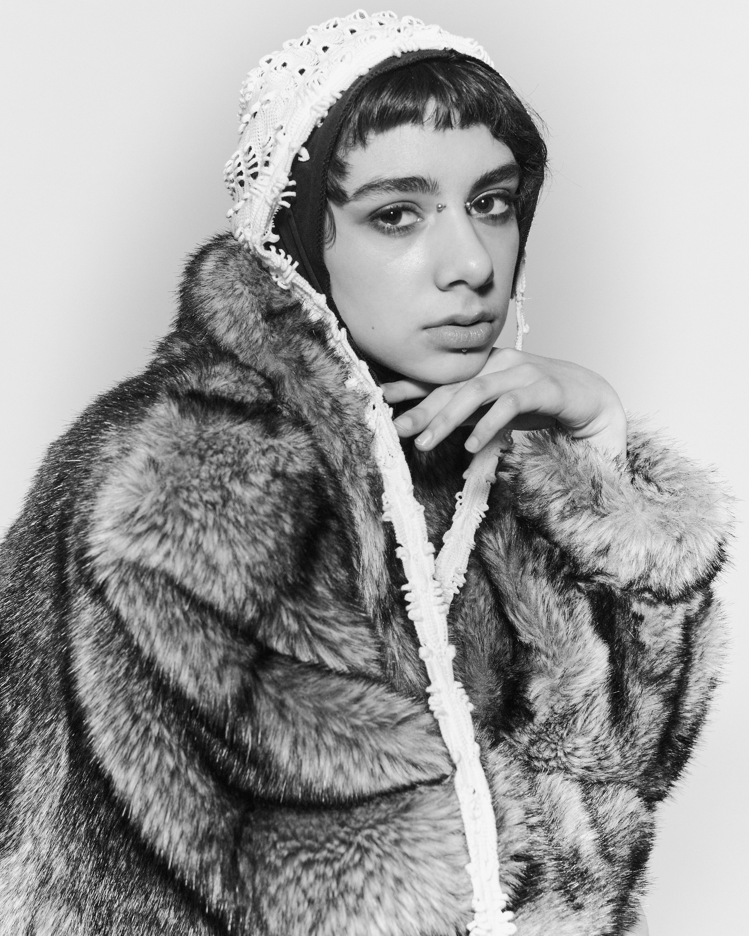
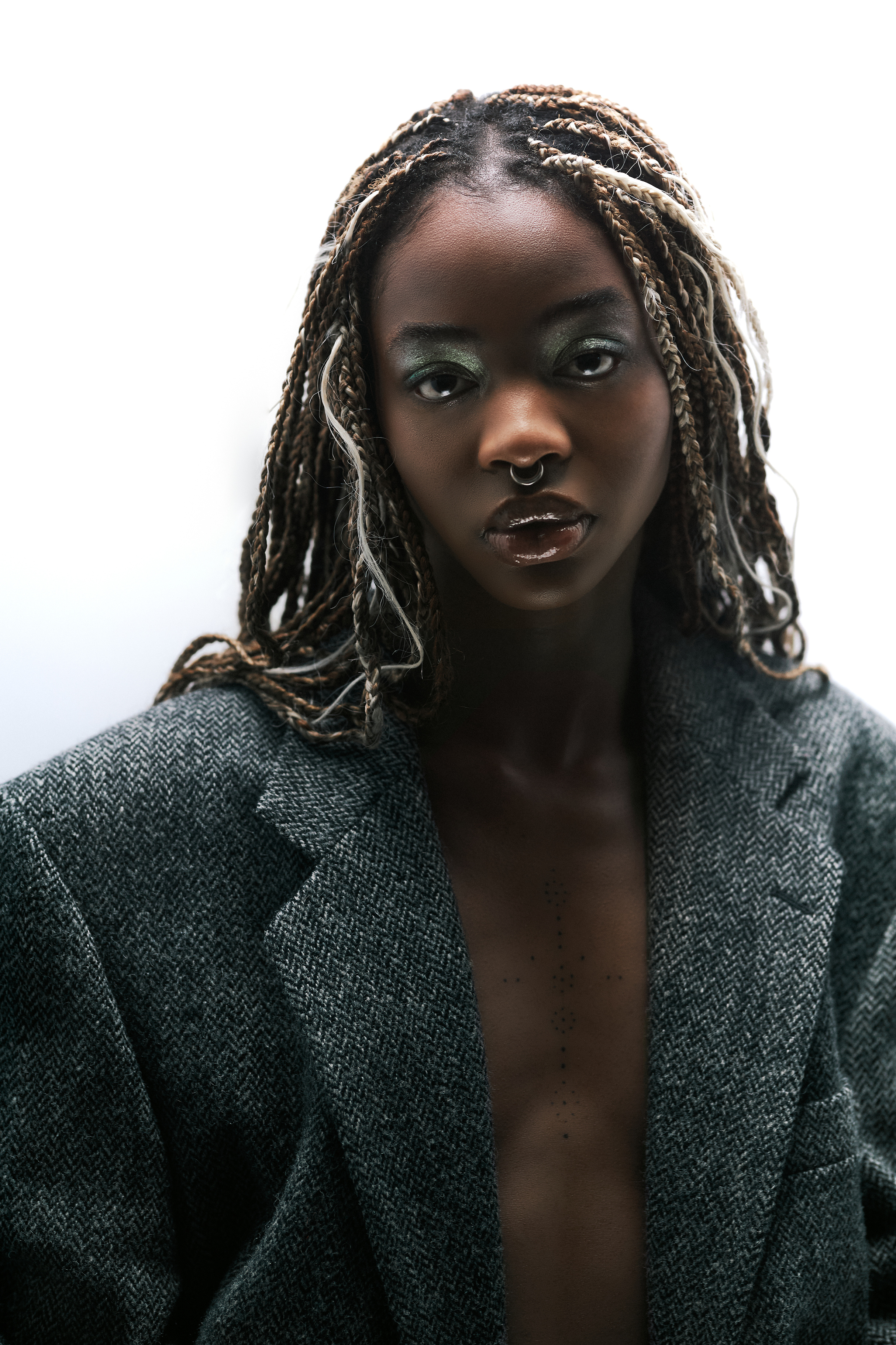
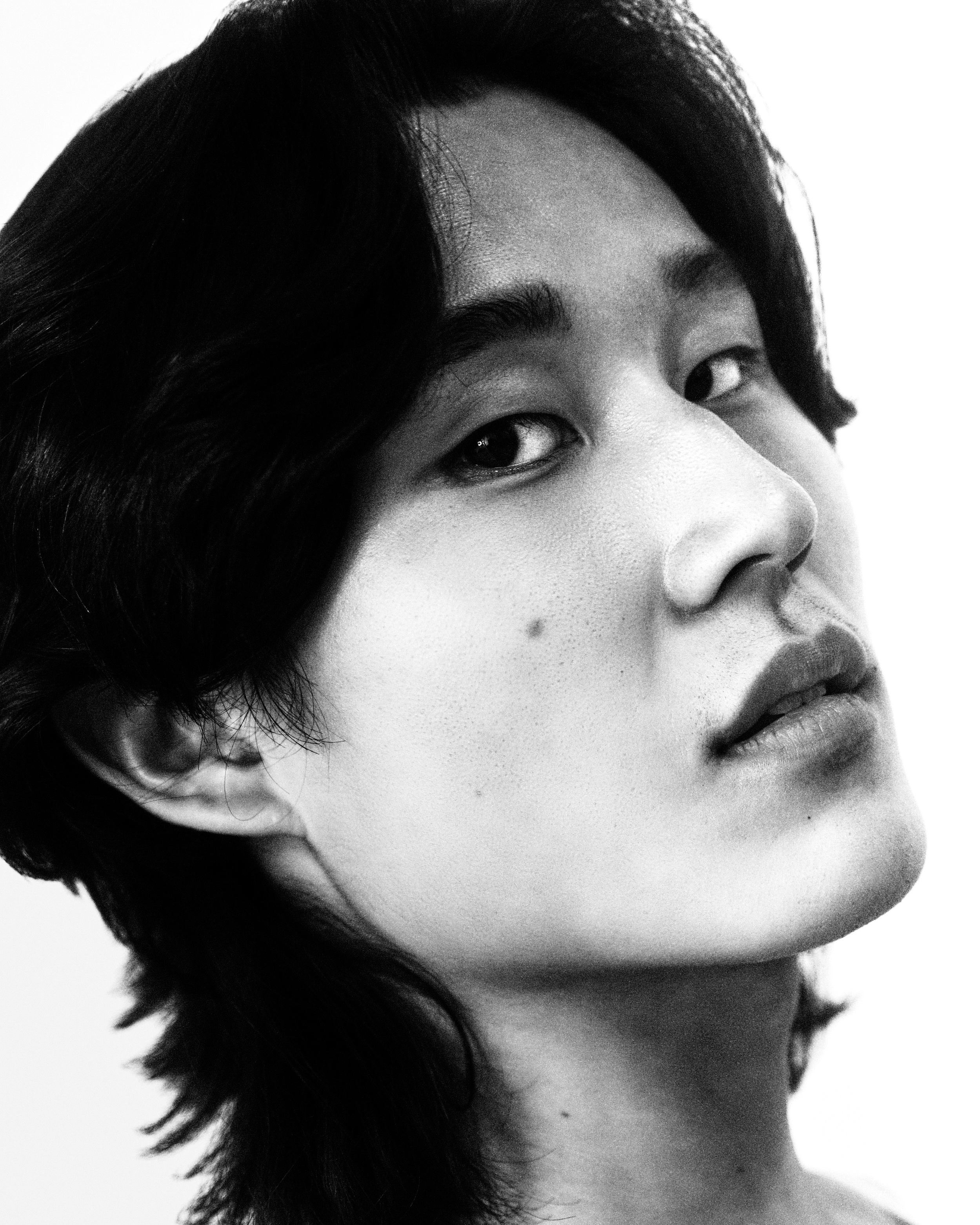
figs. 04 and 05 — the last of five
- design & build
- Greg McCarthy
- photography
- Rafaela Conde & Nicolas Emas Varone