Scroll

Design & Build Case Study

Rafa & Nicky

An image-first portfolio, built so the client can run it themselves.

Published 06/10/26

Rafa & Nicky are an early-career editorial photography duo who needed a portfolio that reads like a magazine, not a template. I designed and built the whole thing — the visual system, the motion, and the front-end — around one idea: get out of the photography's way. The deliverable isn't only a website; it's a codebase, a design system, and a Figma source clean enough that the duo can keep growing it themselves.

The project

The brief and the challenge

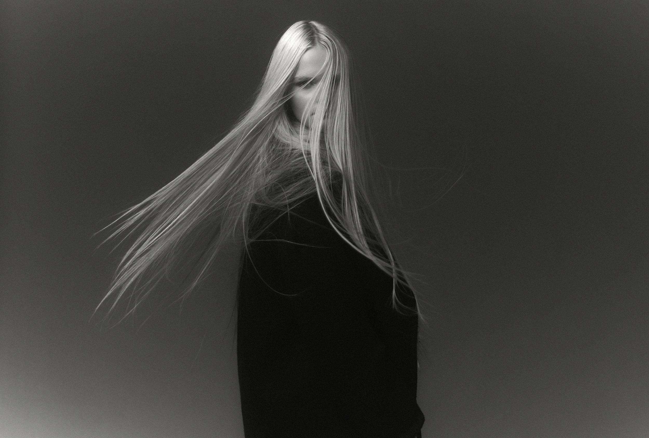
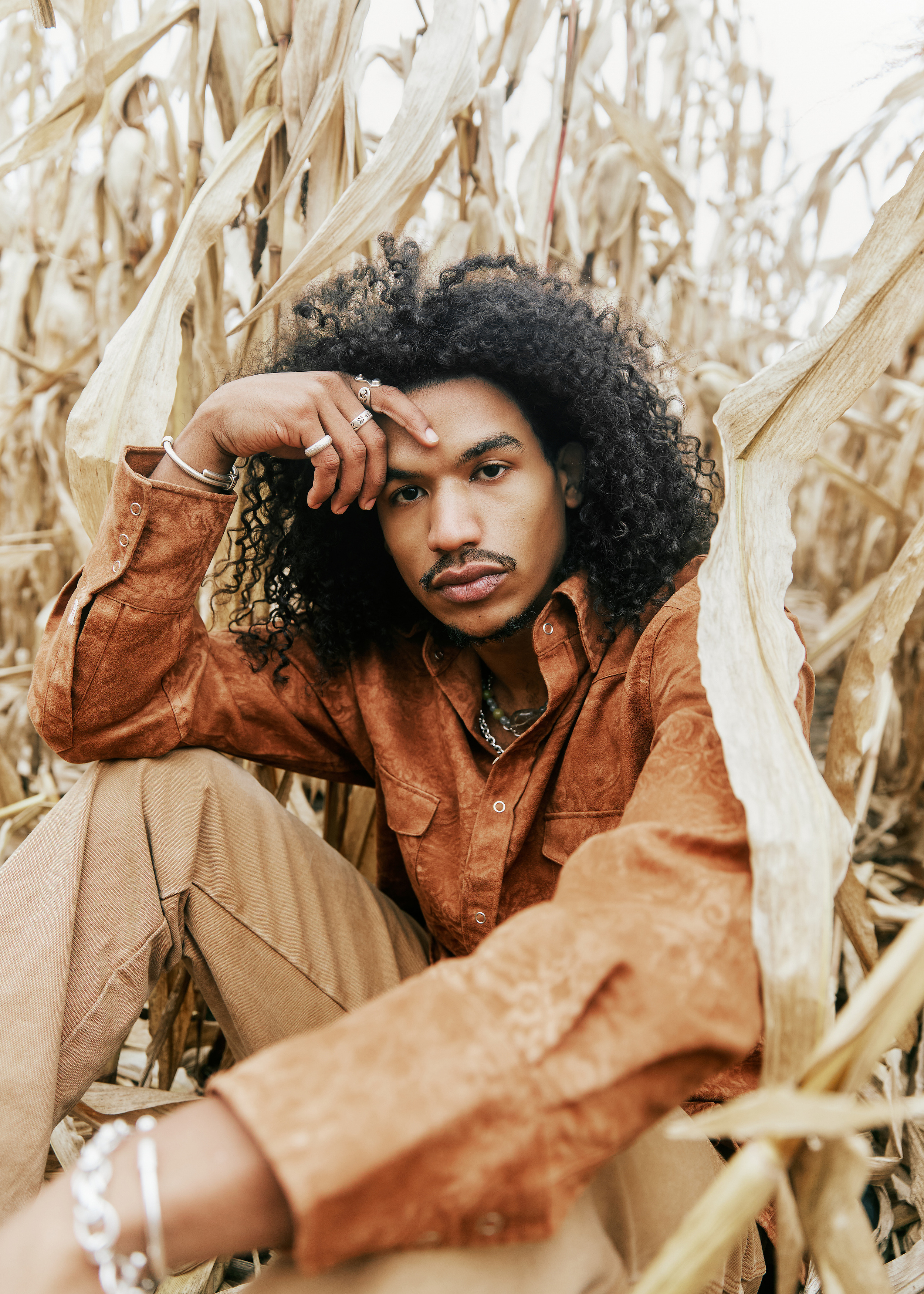
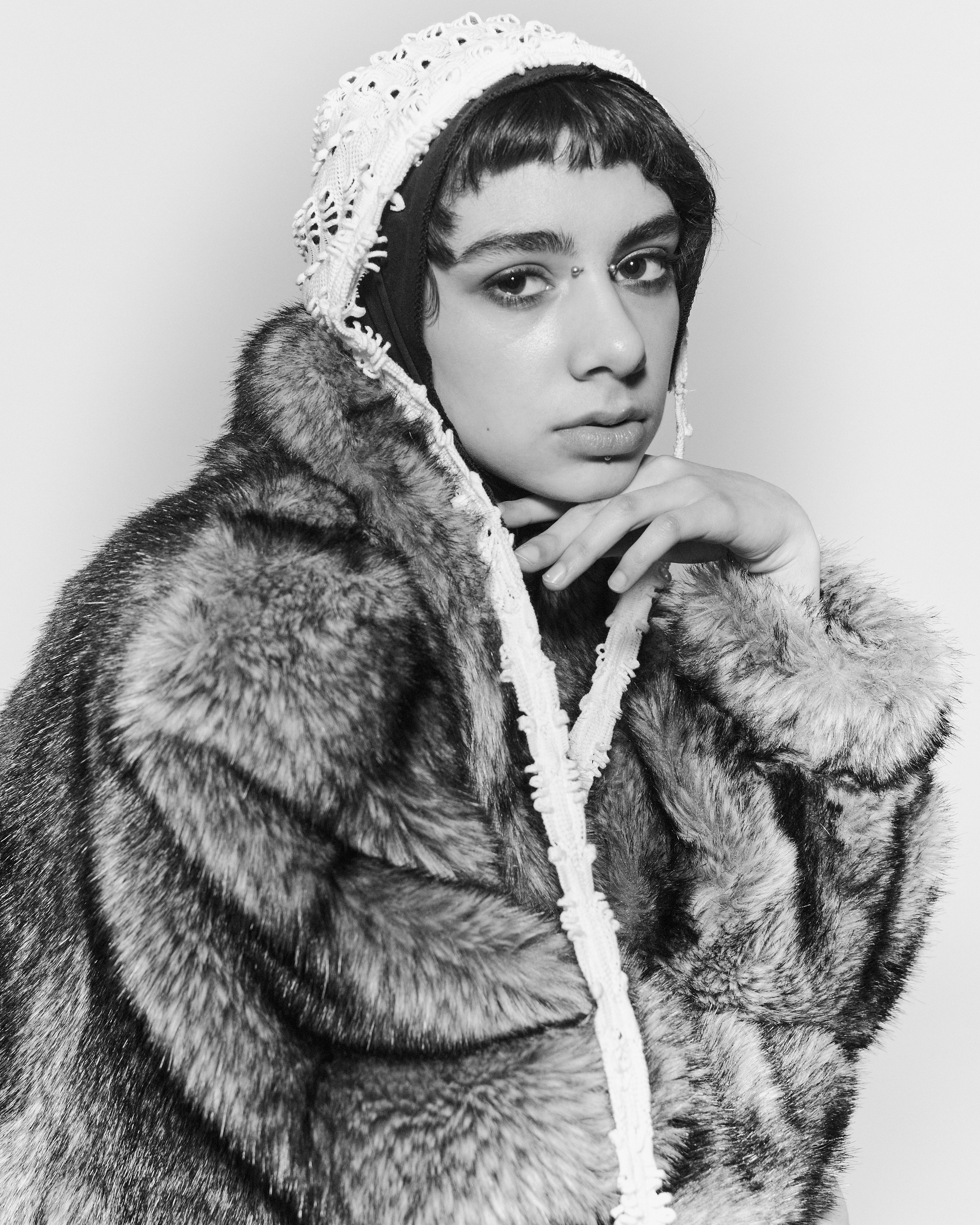
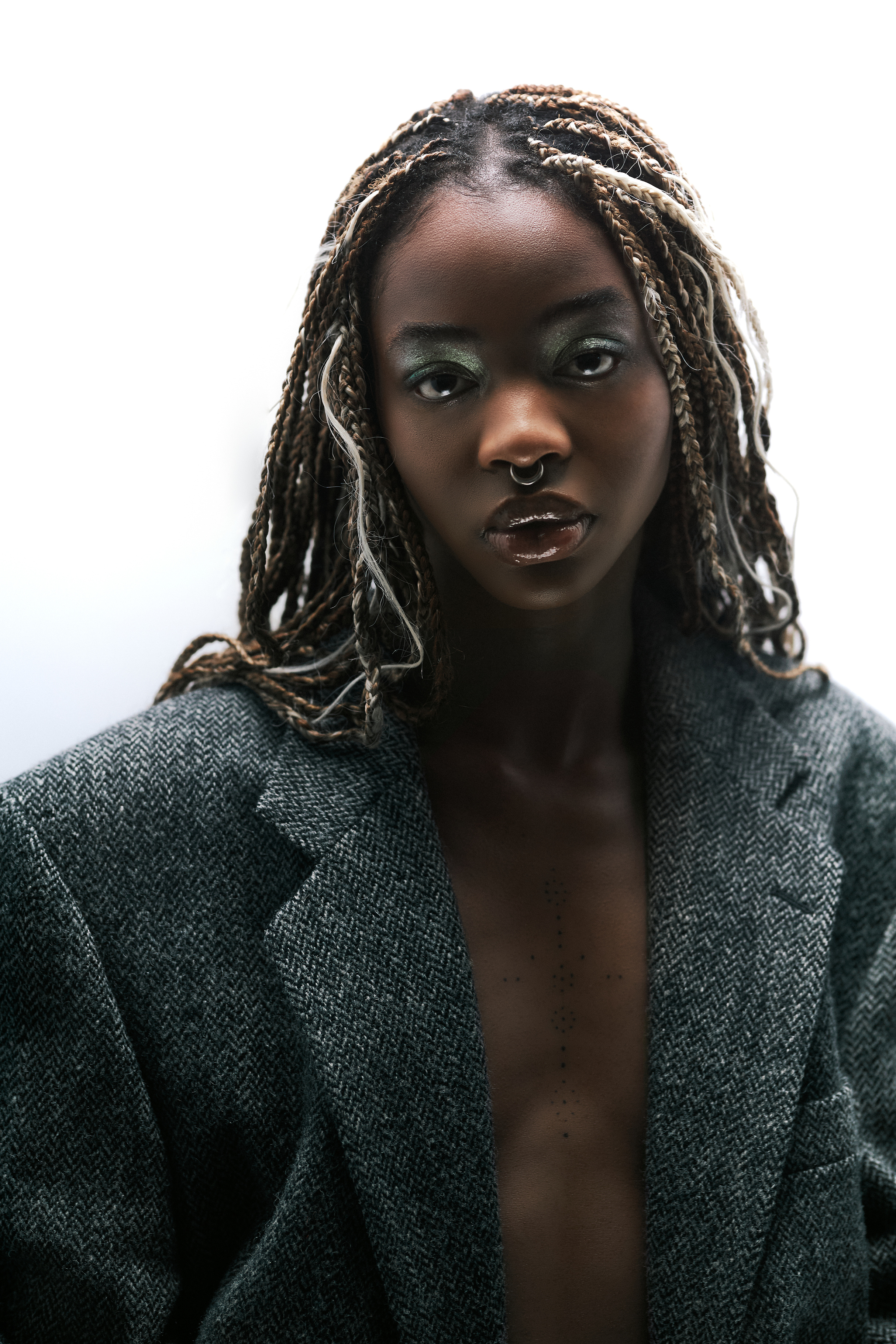
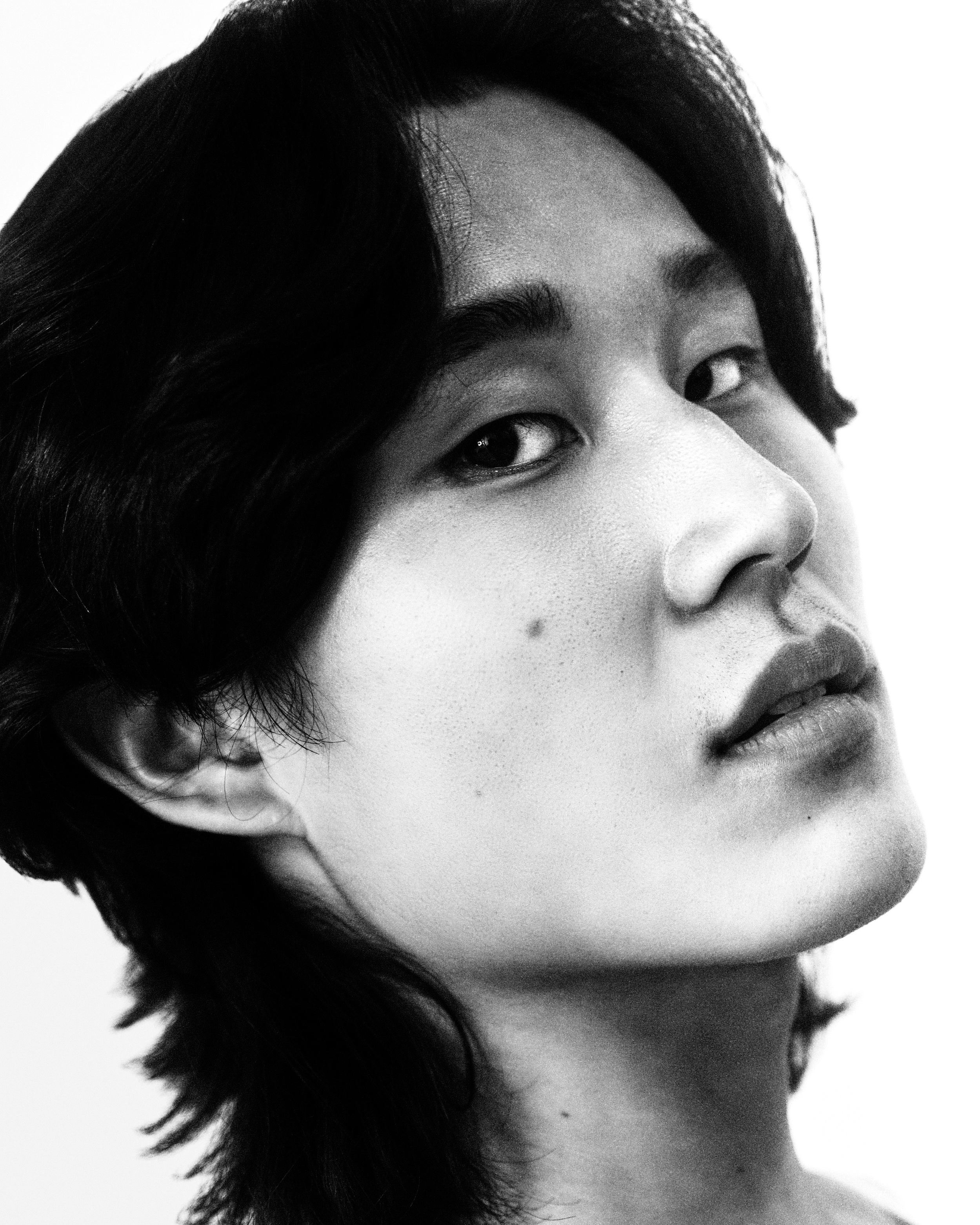
The duo came in with a strong point of view about their photography and almost no infrastructure around it. They needed a portfolio that could carry them from their first commissions towards campaign work — a site that looks like the work belongs on a gallery wall, organised around a few deliberate moments of personality rather than a generic photo grid.

The brief

  • A portfolio that reads as editorial and considered, not as a stock photo grid.
  • Something that grows with them — easy to add new projects and pages as the body of work expands.
  • A clear identity anchor: their hand-drawn signature wordmark, used as the brand device.
  • Built so they — or a future collaborator — aren't locked into me to maintain it.

That last point shaped almost every technical decision that followed.

The challenge

Three tensions had to be resolved at once:

  • Restraint versus personality. The photography needed room to breathe, but a site that's only a grid of images is forgettable. Where does character live without competing with the work?
  • Craft versus handoff. A bespoke, motion-rich site is usually the least maintainable kind. How do you build something custom that a non-specialist can still extend confidently?
  • Ambition versus stage. They're early-career, so the budget and timeline were lean — but the site has to look like it belongs next to photographers two tiers ahead of them.

Direction & research

Grounding the work in who it's for

I started from their photography and a reference-gathering pass — editorial fashion sites, gallery and museum sites, and motion references the duo responded to. The throughline that emerged was typographic restraint plus one signature gesture: borrow the confidence of a gallery wall, then add a single human mark.

To keep those decisions grounded in who the site is for, I mapped six audience personas and ranked them — the photo editor or art director first, the creative collaborator and the small brands to grow into close behind, the wider peer audience last. The ranking is the point: the site is built for the realistic near-term win, not the dream client it can't land yet. Each persona carries its own goals, behaviours, and pain points, distilled to the one question they arrive with:

Photo editor / art director "Three days to fill a slot and twelve portfolios open." Primary target

Commissions shoots for a magazine or editorial platform. Time-poor, lives in portfolios, and will take a creative risk on fresh talent.

Goals
Confirm a distinct, repeatable eye — and that the duo can carry a concept all the way to a finished story, on deadline.
Behaviour
Arrives by referral or Instagram. Judges in under 60 seconds, opens ~5 images, then bookmarks or bounces.
Needs
A work-first landing, an obvious visual signature, full story and credits per shoot, one-click contact.
Pain points
Splash intros, slow or low-res galleries, a buried email, a book that feels scattered.
Design response
No intro before the images. Personal shoots presented as full editorials. Email and credits always within reach.
Brand / agency creative director "I need to feel safe putting this in front of the client." Aspirational

Realistically an emerging brand, indie label or e-comm startup on a small budget — a first commercial client, not a national campaign.

Goals
See that the duo can shoot product and people cleanly and on-brief, not only moody personal work.
Behaviour
Builds a shortlist to forward internally. Looks for proof the work is desirable — and that you're easy to brief.
Needs
Shareable, linkable project pages and a clear sense of professionalism.
Pain points
Can't tell if you take paid commercial work; a faked "commercial" section built on one weak shoot.
Design response
Editorial and commercial stay unified until real commercial work exists — but the structure is ready to split them later.
Creative collaborator "Is this someone I want my name next to?" High leverage now

A freelance stylist, MUA, set designer or producer weighing a test shoot or collaboration. At this stage, the next break often comes from here.

Goals
Judge aesthetic fit, and see who the duo have already worked with.
Behaviour
Studies styling, lighting, and the full team credited on each shoot.
Needs
Per-project credits, an authentic About, an easy DM or email, and some process or BTS.
Pain points
No credits listed, no personality, no obvious way to reach you.
Design response
Every collaborator credited by name — borrowed credibility. The About page kept genuinely human.
Modelling agency & talent "Worth sending our talent to?" The network

Bookers, scouts, or models vetting before a test or booking — very often on a phone.

Goals
Gauge how the duo shoot people, and how the images would sit in a model's book.
Behaviour
Focuses on portraits and figures, image quality and consistency.
Needs
A strong mobile experience, people-focused work up front, a live Instagram link, and contact.
Pain points
A broken mobile layout, inconsistent quality, no social link.
Design response
Mobile-first imagery, with Instagram surfaced prominently as a live feed.
Press / curator / gallery "A bio, a statement and selects — fast." Cheap prestige

A journalist, curator or festival reviewer. Low traffic, high credibility payoff — premature to chase, cheap to support.

Goals
Pull a credible background, an artist statement, and press-ready assets.
Behaviour
Skims for an Info page, scans the statement, grabs contact.
Needs
A real About / Info page — statement, short CV, contact — with high-res on request.
Pain points
No bio, no statement, no contact path.
Design response
One proper Info page — statement, short CV, contact — with room to add a press list later.
Peer / aspiring photographer "I love this — how did they get that look?" Audience, not client

Students, emerging shooters, and fans. High volume, near-zero direct revenue — but the discovery engine that feeds the editors above.

Goals
Inspiration, learning, and following along.
Behaviour
Scrolls the work, follows on Instagram, shares the link.
Needs
Work that's effortless to share and a follow that's obvious.
Pain points
Nothing easy to share, no clear way to follow.
Design response
Work made effortless to share and the follow obvious — without letting this audience dictate the layout.

One insight from that work shaped the entire site. An early-career book can't lean on big logos or stacks of tearsheets, so the job is to make a lean résumé read as inevitable talent and lower the risk of being someone's first commission.

The biggest lever is curation, not volume. Three tight, cohesive projects signal taste; twelve scattered ones signal still-figuring-it-out.

That principle is why the site leads with a small, deliberately edited body of work.

The signature

From first directions to a mark that moves

The signature became the brand's anchor — but not on the first pass. It moved through a run of directions: an elegant script that read clean but a little safe, then bolder block and graffiti explorations, before settling on the final hand-drawn mark. The early directions didn't stake out a position; the final signature does, nudging the duo towards the culture-adjacent work they want to grow into. It carries the personality so the rest of the interface can stay neutral.

Final mark The hand-drawn signature the site now opens on.
v1 Script
v2 Block
v3 Trace

The earlier directions, v1 to v3 — an elegant script, then bolder, then narrowing in on the final mark above.

The landing page opens on that signature, large and centred. On the visitor's first interaction it shrinks into the top-left corner to become the navigation logo — a single continuous motion (a FLIP animation) that spends the first click on the gesture itself, then behaves as ordinary nav from there on.

The speed is deliberate. The goal was the least friction possible at the start: plant a strong identity by introducing the signature first, then get out of the way and into the work fast. The mark holds just long enough to register, then hands off almost immediately to the images. It's an intro, not a gate — identity, then the photography, in about a second.

The collage

Presenting the work as one continuous strip

The work isn't presented as a paginated grid. It's one continuous collage — a strip of overlapping frames you scan across like a gallery wall. That was the point: the layout is built to feel like an exhibition hang, and it quietly nods to Rafa & Nicky's more artistic roots before they moved towards editorial.

Technically it's a custom transform engine — the strip loops seamlessly in both directions with drag momentum, wheel, and an ambient drift. On mobile the same engine is rotated to scroll vertically, so the phone gets a true mirror of the desktop experience rather than a watered-down version. Hovering a frame surfaces a project label and lifts that image forward; the focus is carried by the image itself, not by dimming everything around it.

A small craft detail I'm proud of: the mark and all the site chrome are painted white and composited with a difference blend mode, so the same element reads near-black on the paper background and automatically inverts to white when it passes over a photograph — no second colour, no manual theming.

Live, not a screenshot: one element, painted white and difference-blended. Drag the strip — the real site nav, the signature wordmark and the hand-drawn menu mark, reads near-black over the paper gaps and inverts to white the moment a photograph slides under it.

Around the collage sits a small, consistent kit: an overlay "Selected Work" menu that opens in place rather than navigating away, individual project pages with a staggered editorial gallery and a full-screen lightbox, and an About page — all assembled from the same shared, documented components.

Not a screenshot — the live project page, running here from its own HTML, CSS and JavaScript. Click to open it full-screen: scroll it, open the Selected Work menu, click a photograph to enlarge it. The same shared components doing their job across the rest of the site.

Testing & iteration

Lean sessions that changed real decisions

The site went through two quick rounds of user testing. We kept it deliberately lean — a small handful of participants rather than a formal study — but enough to catch where the experience and our assumptions diverged. Feedback from those sessions was folded back in and changed real decisions:

  • The logo. The signature mark went through the most change off the back of testing — I refined how it reads and how it behaves as the brand anchor, until it landed on the hand-drawn signature and its shrink-into-the-corner moment.
  • Mobile navigation switched to vertical scroll. What worked as a horizontal strip on desktop didn't feel right under a thumb. Testing pushed the phone experience to a vertical scroll — the same continuous collage, reoriented to how people actually hold and move through a phone.
  • Card hover interactions. I reworked how the work frames respond on hover in response to feedback — tuning what surfaces, and how, so the interaction reads as intentional rather than noisy.
A Rafa & Nicky editorial photograph filling a work-frame tile.
Before. A flat wash — on hover the photo lightens and the title fades up in plain black type. Legible, but inert.
The same photograph, with the liquid project card blooming up on hover.
After. The "funk" — a liquid oil-slick card blooms up over the image and the title inverts through it.

Hover each frame to compare. Same photograph, same tile — only the hover treatment changed, from a flat tint to the liquid card the site ships today.

Testing lean and early beat polishing in a vacuum: a couple of short sessions were the cheapest way to surface this feedback, and they spared a far more expensive course-correction later.

Locking the system

Design and code kept in lockstep

Everything you've just scrolled through — the signature, the collage, the project pages — is assembled from one system, locked down before any of it was built. With the direction settled, I formalised it in Figma and in code together:

  • A semantic colour palette — a warm off-white "paper" ground, near-black type, and a coral accent held in reserve for the site to grow into. Every value is a live Figma variable with light and dark modes, mirrored one-to-one as CSS custom properties so design and code never drift.
  • A type scale built on Space Grotesk, named to match the Figma styles and stepping through discrete sizes at each breakpoint rather than scaling fluidly — so type always lands on intentional values.
  • Accessibility baked in — every text-on-ground pairing was tuned to clear WCAG AA contrast, and three swatches were nudged darker and pushed back into Figma so the source of truth stays accessible too.

Figma variables

Ground

Background#faf9f6
Surface#f1efea
Placeholder#e9e7e3

Text

Primary#252525
Secondary#454545
Tertiary#717171

Accent — warm coral

Default#ff8282
Hover#f76b6b
Pressed#e85a5a

Feedback

Success#397e59
Error#c23b22
Warning#926a22
CSS tokens
:root {
  /* Ground */
  --paper: #faf9f6;
  --surface: #f1efea;
  --placeholder: #e9e7e3;

  /* Text */
  --primary-type: #252525;
  --secondary-type: #454545;
  --tertiary-type: #717171;

  /* Accent */
  --accent: #ff8282;
  --accent-hover: #f76b6b;
  --accent-pressed: #e85a5a;

  /* Feedback */
  --success: #397e59;
  --error: #c23b22;
  --warning: #926a22;
}

One palette, mirrored — edit the value once and it stays honest on both sides. Three swatches were nudged darker for WCAG AA and pushed back into Figma, so the accessible value is the source value.

Pinning the system down this early — and keeping it honest across Figma and the code — is what later made the handoff possible.

The handoff

Building it so the client owns it

This is the part I'm most deliberate about. The handoff isn't a static site someone else has to reverse-engineer; it's a codebase written so Rafa & Nicky can maintain and grow it using Claude Code. New work goes in by dropping files into a folder — the page templates and shared components are already there — and the documentation is written for that workflow: plain-language instructions an AI assistant, or a human, can follow to add a project, a page, or a style.

  1. Drop in content Add the photos and a few lines of copy to a new project folder.
  2. Claude wires it up Templates, shared components & CLAUDE.md do the assembly — no hand-coding.
  3. Live site Publish, and the new project is on the site.

How the client keeps the site growing — drop content into the folder, follow the templates, publish.

Key decisions

  • No framework, no build step. The entire site is plain HTML, CSS, and a little JavaScript — you can open the files directly in a browser. This wasn't nostalgia; it was the handoff strategy. No package manager to keep current, no toolchain to break, no framework to age out. In five years it still opens.
  • Design in Figma, prototype in code. I used Figma for the look and the key screens, then built the working prototype directly in code rather than wiring up a clickable mockup. The prototype and the final product are the same artefact, so there's no throwaway step between approval and launch.
  • Design tokens as a contract. Colour, type, spacing, and motion all live as named tokens in one file, mirrored from Figma — so the design and the site stay honest with each other.
  • Documented as it was built. The docs couldn't be an afterthought, so they were written alongside the code: a CLAUDE.md that orients anyone opening the folder, a design-token reference, and a working agreement that keeps it all honest as the site grows.

The engagement is ongoing: I'm developing a brand manual to sit alongside the site — codifying the signature mark, the type system, colour, and usage rules — so the identity holds together as Rafa & Nicky's presence grows beyond the website.

Outcome & reflections

Where it stands, and what I'd carry forward

The duo gets a portfolio that looks the part — image-first, editorial, with enough signature personality to be memorable — and, just as importantly, a site they can run themselves rather than a deliverable they have to maintain through me.

The site is a working prototype heading towards launch — built not as a clickable mockup but as the real, deployable thing. The remaining work is small: finalising exactly which content goes where, then optimising imagery and going live.

What I'd carry forward

  • Sketch it before you build it. Working the type system, layout, and components out on paper and in Figma first meant the build was about realising decisions, not making them — which is what made it fast and the handoff trivial.
  • One gesture beats ten. Spending the personality budget on a single moment — the signature — let everything else stay calm and let the work lead.
  • Pitch the craft at where the client's going. They're early-career, but the site had to look like it belonged next to photographers two tiers ahead — so the system, the motion, and the restraint were built for the duo they're becoming, not the stage they're at.
  • Handoff is a feature. Building the site so the client can extend it themselves turns a one-off project into something they own outright — a more honest kind of value than locking a client into me for every future edit.

Design & build — Greg McCarthy. Photography — Rafaela Conde & Nicolas Emas Varone (Rafa & Nicky).