UX Case Study

No Road Block

A live, community-reported trail-status site — researched, prototyped, and shipped.

Published 14 May 2026 · Updated 11 July 2026

No Road Block is a live web app where people walking Toronto's Lower Don Trail report and check real-time closure statuses. It began as a four-week research project into how people navigate trail closures — the research and prototype became the blueprint, and a five-day production sprint turned them into a shipped product with its own identity, mapping, backend, and print collateral.

Summary & introduction

A broken system, a prototype, and a live product

Problem statement

Trail users feel overwhelmed by disorganised and inconsistent information sources — both online and on-site — during closures. Current solutions fail to balance informational value with usability, detracting from the natural experience.

Objectives

  • Present closure information in a highly scannable way
  • Reduce time on task for finding a detour
  • Maintain a sense of discovery and exploration for newer trail users

The solution, shipped

The project moved through two stages. A four-week research sprint produced a Figma prototype that could get a trail user from a closed entry point to actionable detour directions in three taps. Then, in July 2026, the ideas that survived testing shipped as No Road Block — a live, community-reported status site for closures and barricades on the trail. Walkers scan a QR code at an access point, see what others are reporting, and add their own report with one tap.

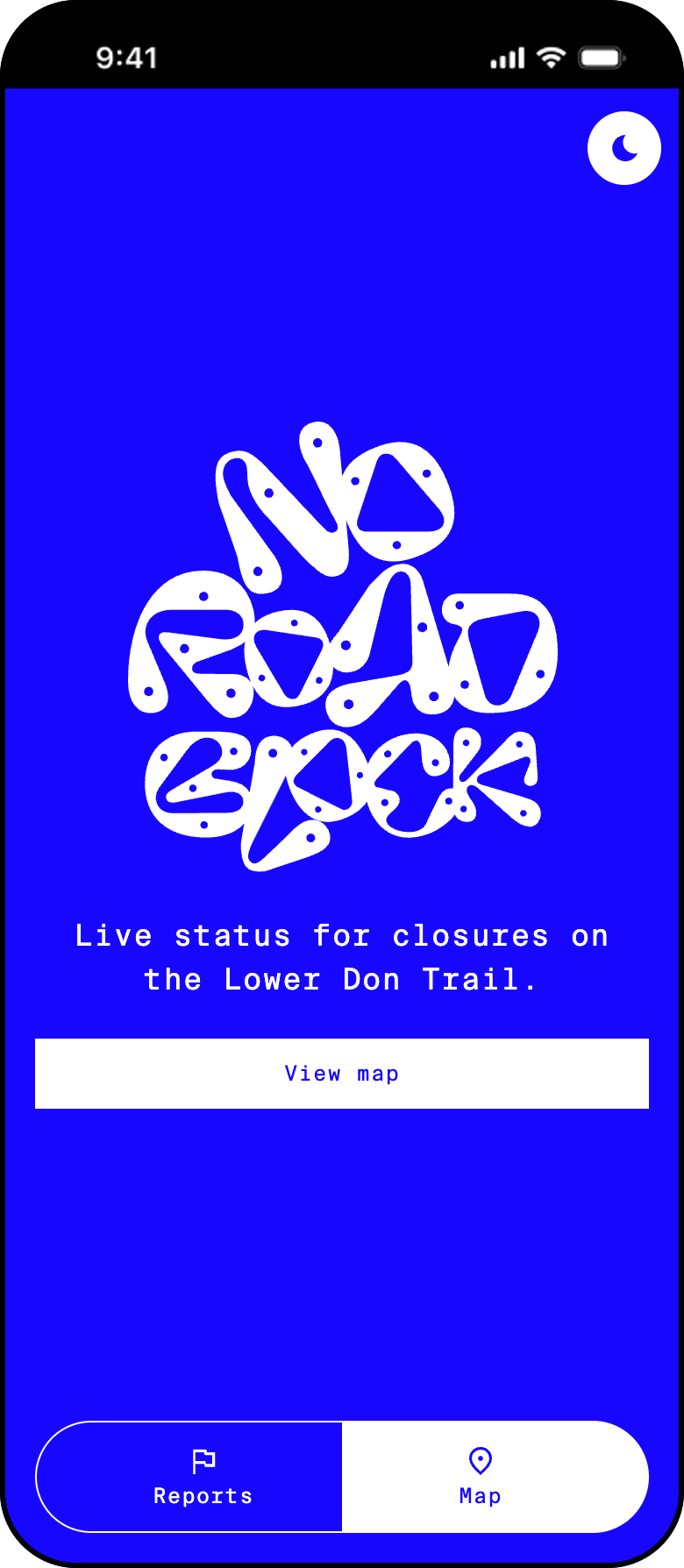
No Road Block home screen with stacked wordmark, tagline, and view-map button

The live No Road Block home screen. The product shipped with its own identity — a hand-drawn stacked wordmark and a two-tab structure: reports and map.

The research foundation

The data that shaped everything that followed

Two findings from four weeks of research went on to define the shipped product: the answer people need is a simple, high-level status — not a document — and they need it at the access point, standing in front of a barricade, not at home planning a route. Everything the live site does traces back to those two facts.

Getting there meant compiling municipal notices and social-media posts into a report on trends and user sentiment, then interviewing trail users about how they navigated the closures in practice.

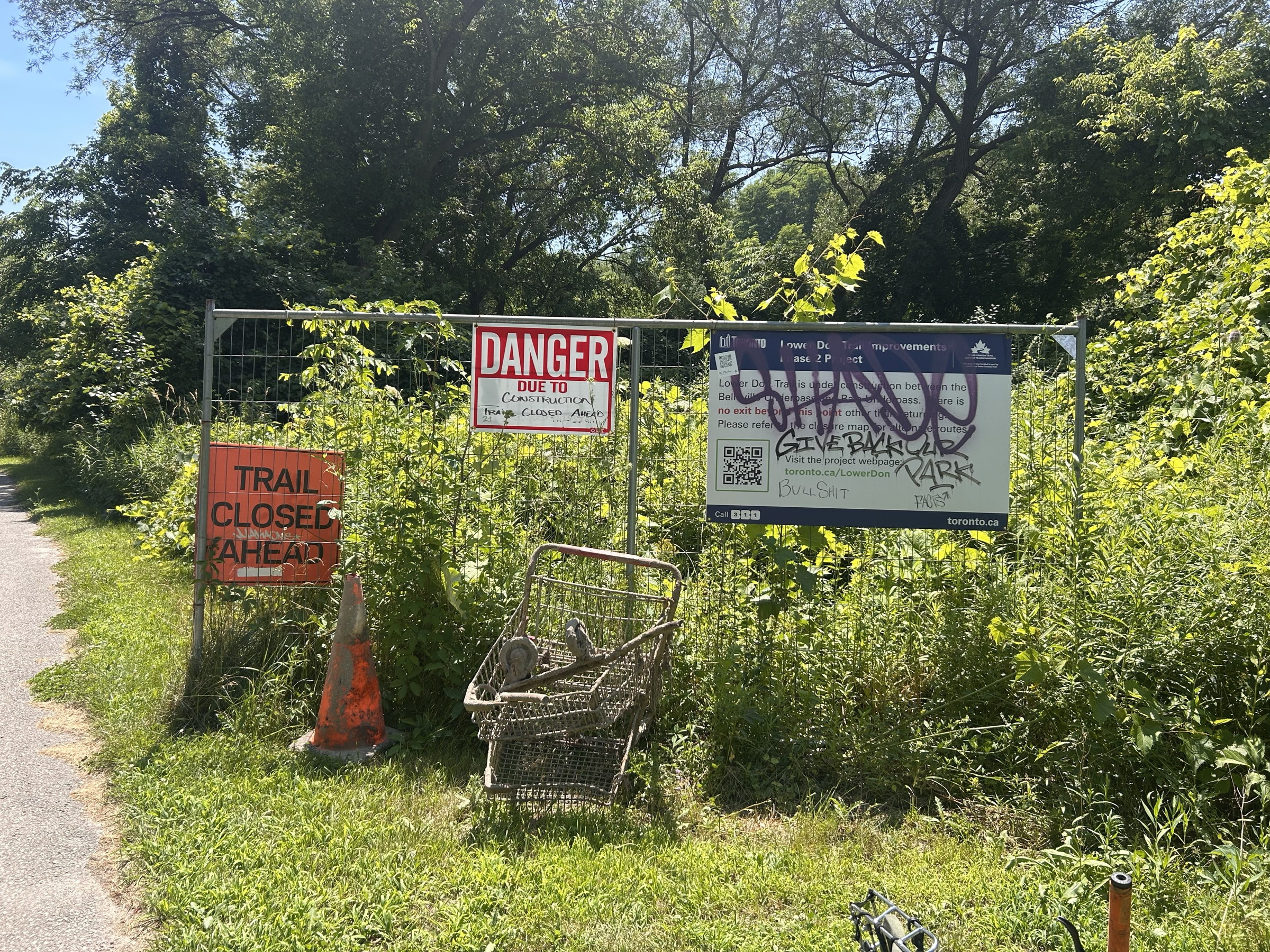
Existing trail entrance signage with no detour information

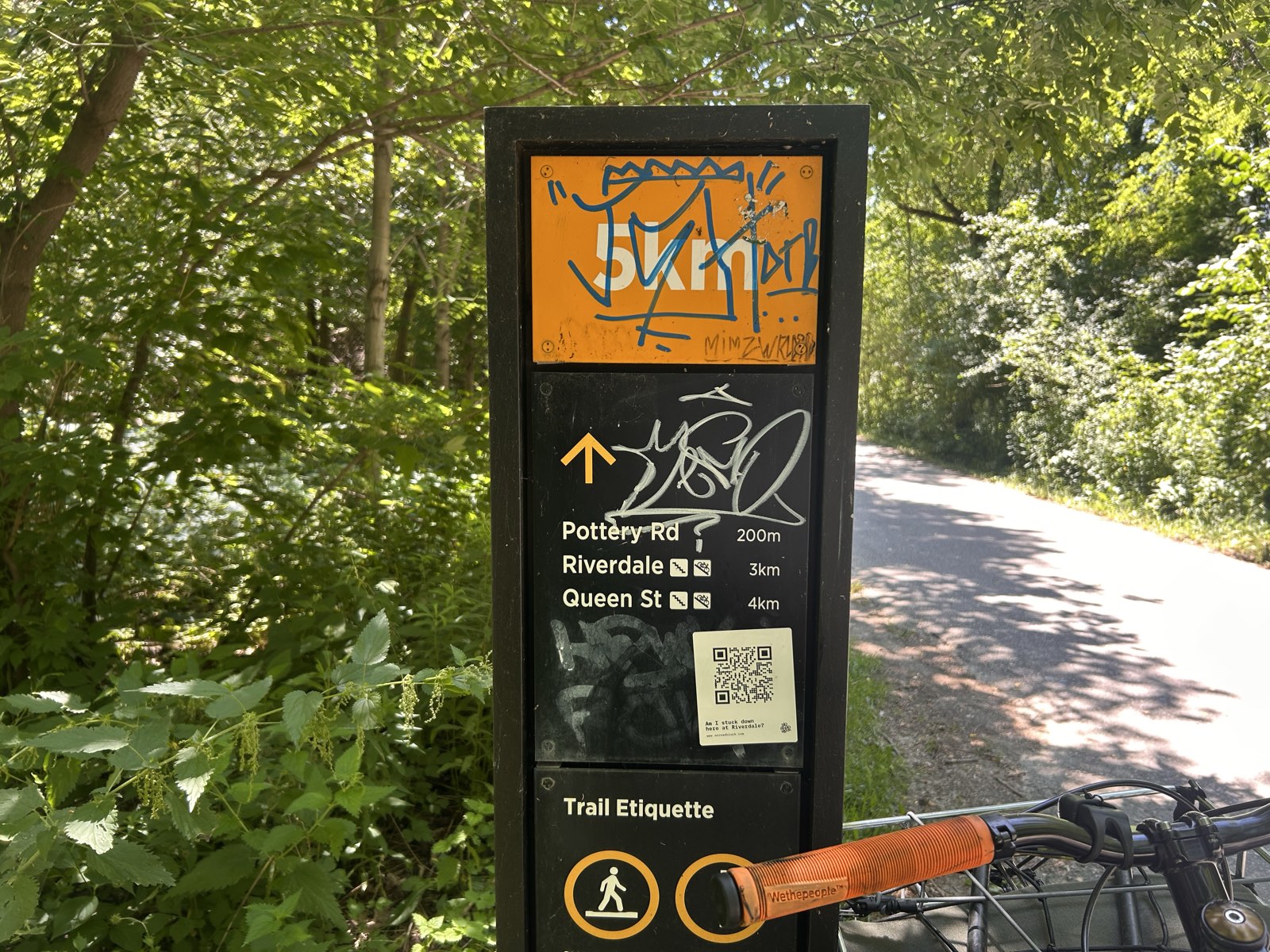
Current state at trail entrances — note the lack of signage and information about detours.

Key takeaways

The lack of usable information at closure sites led to trail abandonment and detour avoidance, and what information existed didn't match user needs. People wanted high-level answers — "Where can I access the trail?", "Is it a paved or a nature trail?" — not granular status updates. Consolidating the data also surfaced the patterns that later shaped the product's information architecture: users orient by bridges, and think in stretches of trail between access points rather than in official section names.

From insights to a working prototype

Testing and refining the model the product is built on

Initial prototypes tested a data-visualisation model with charts showing trail conditions and access points. While this approach worked for experienced users on-trail, it failed newcomers who couldn't locate detours in the first place. The flows were rebuilt to start with finding a detour before bringing the user to the trail map, and the tile diagram gave way to a real map — satellite imagery in the prototype, and ultimately the product's own map theme — fixing the accessibility problem baked into the first version, where colour carried all the information. The pair below shows the full distance travelled: the first tile-based map, and where the idea landed in production.

Original prototype trail map with tiled sections in black, blue and green, a closed section marked with a no-entry symbol, and Trail Map, Images and Summary tabs

Original. The prototype's tile-based trail map. It helped frequent trail users, but testing revealed gaps: detours were hard to find from a closed entry point, and colour-only communication limited accessibility.

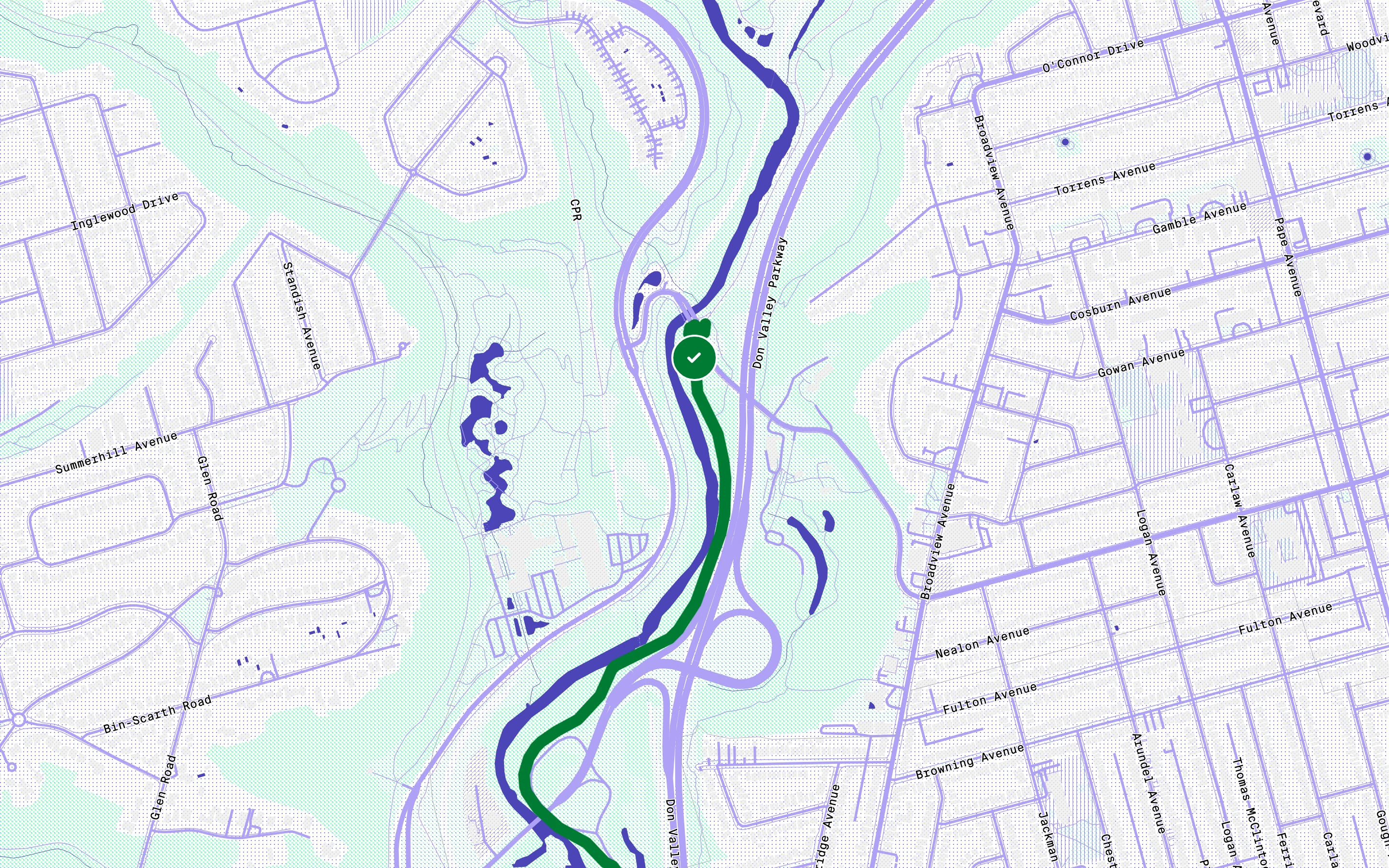
The live No Road Block map focused on Pottery Road: a green clear-status disc on the trail, a card reading 'Reports, last 24 h' with a Report status button, floating map tools, and the Reports/Map bottom navigation

Updated. The live product. The Pottery Road access point on the shipped map: status carried by icon and colour on the disc and the trail itself, one-tap reporting on the card, and the custom screenprint map theme underneath.

When familiarity beats novelty

Testing showed the novel data-visualisation approach was, in real-world use, less effective than a traditional map. Users oriented themselves by bridges — the most recognisable landmarks on the trail — and preferred a general overview of green space between them over a detailed breakdown. Customising Google's Material Design System made the rapid redesign possible, translating wireframes into a working UI in days while keeping edge states and accessibility covered.

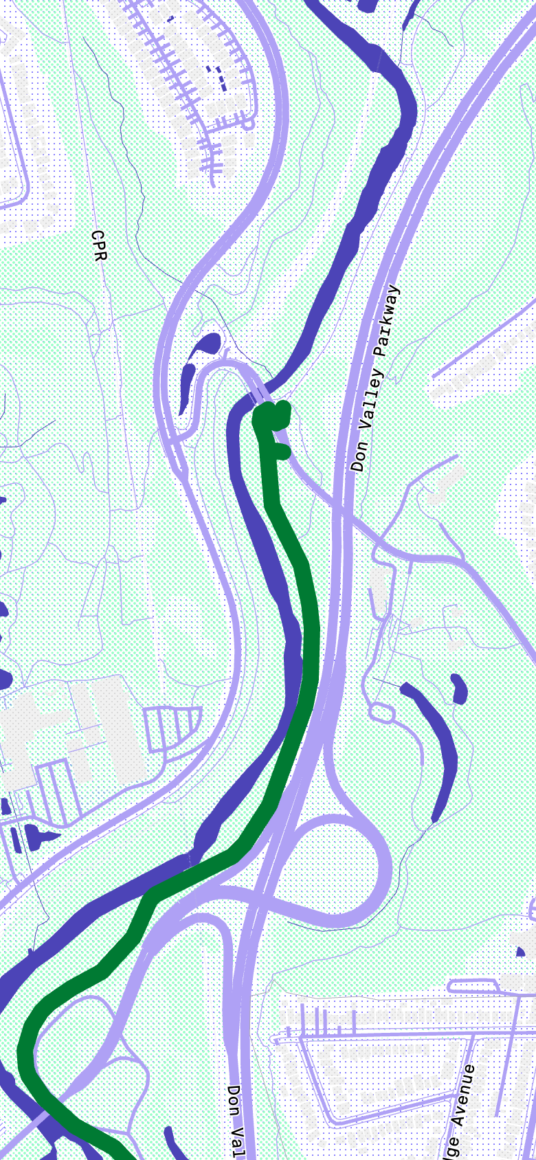
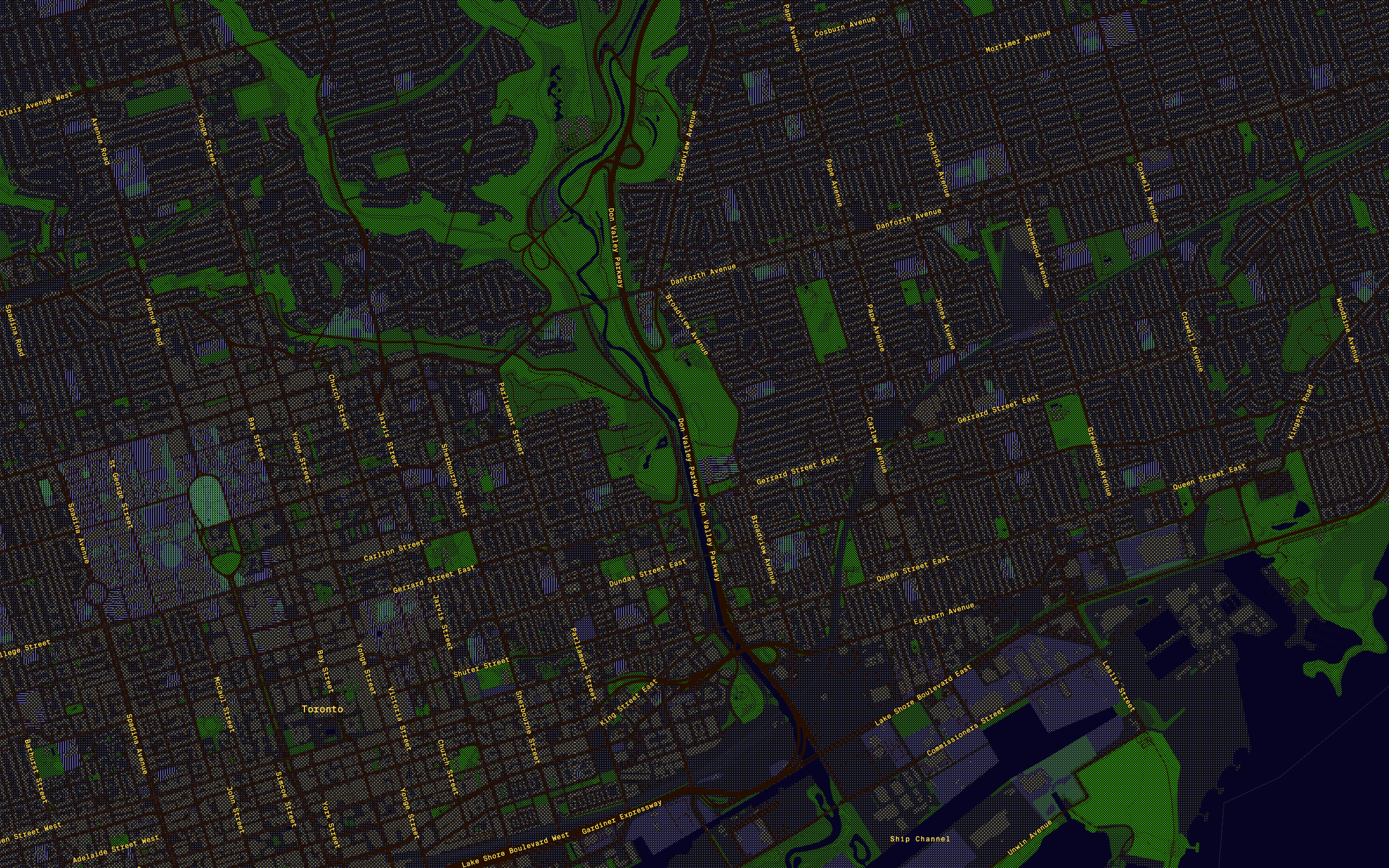
The Lower Don Trail corridor rendered in No Road Block's dark map theme, the trail picked out in white against the dithered city

The trail corridor in the shipped product's dark map theme. © OpenStreetMap contributors.

The curb-cut effect, and its limit

Audio directions entered the prototype as an accessibility feature for low- and no-vision users, and testing gave them a bigger role: eyes-free updates suited everyone trying to stay in the landscape rather than on a screen. But the same logic that promoted audio would eventually retire it. If familiar patterns beat novel ones, the most familiar navigation tool is the one already on every phone — and shipping would prove exactly that. What survived to production was the curb-cut principle itself: decisions made for accessibility, like labels and icons alongside colour, shipped for everyone.

Novel visuals can be powerful for insight, but familiar patterns — maps, concise labels, plain language — win for speed and inclusion.

The prototype

Three taps from closure to detour

The Trail Sections prototype was the stepping stone, not the destination. Its core flow had one job: get someone standing at a closure moving again in as few interactions as possible. Two of its ideas became No Road Block's foundations: the trail understood through its access points, and plain-language answers before wayfinding.

  1. Home
  2. Find a detour
  3. Bayview detour
  4. Directions
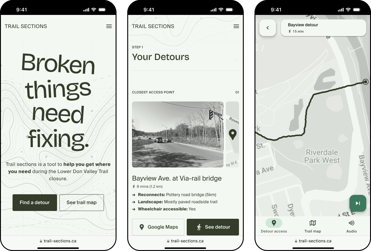
Three prototype screens side by side: the Trail Sections home reading 'Broken things need fixing', the Your Detours access-point card for Bayview Ave at the Via-rail bridge, and the Bayview detour path preview on a map

Three artefacts from the validated flow: the detour-first home, the closest access point with its detour card, and the Bayview Avenue path preview. The full click-through prototype is in Figma below.

What testing proved

12 sec Median time from home screen to actionable detour directions.
3 taps Down from 10+ screens across two municipal sites.
1 site Centralising closure info, access points, and detours.

From prototype to product

What shipping for real changed

The prototype validated the experience, but it rested on an assumption: that timely, accurate closure data would exist to feed it. In practice, no such feed does — municipal notices lag reality by days, and conditions on the trail change hour to hour. Building the product meant confronting that gap head-on.

Flipping the data model

The answer came from the research itself. Users' core question at a barricade — "can I get through?" — is one the people already on the trail can answer better than any document. So the live product inverts the model: instead of pulling from municipal sources, it lets walkers report conditions themselves. Three statuses — clear, on foot only, or blocked — reported in one tap, aggregated in real time. The community becomes the data feed the prototype was waiting for.

  1. Scan at the barrier
  2. See live status
  3. Report in one tap
  4. The next walker knows

Closing the loop the signage left open

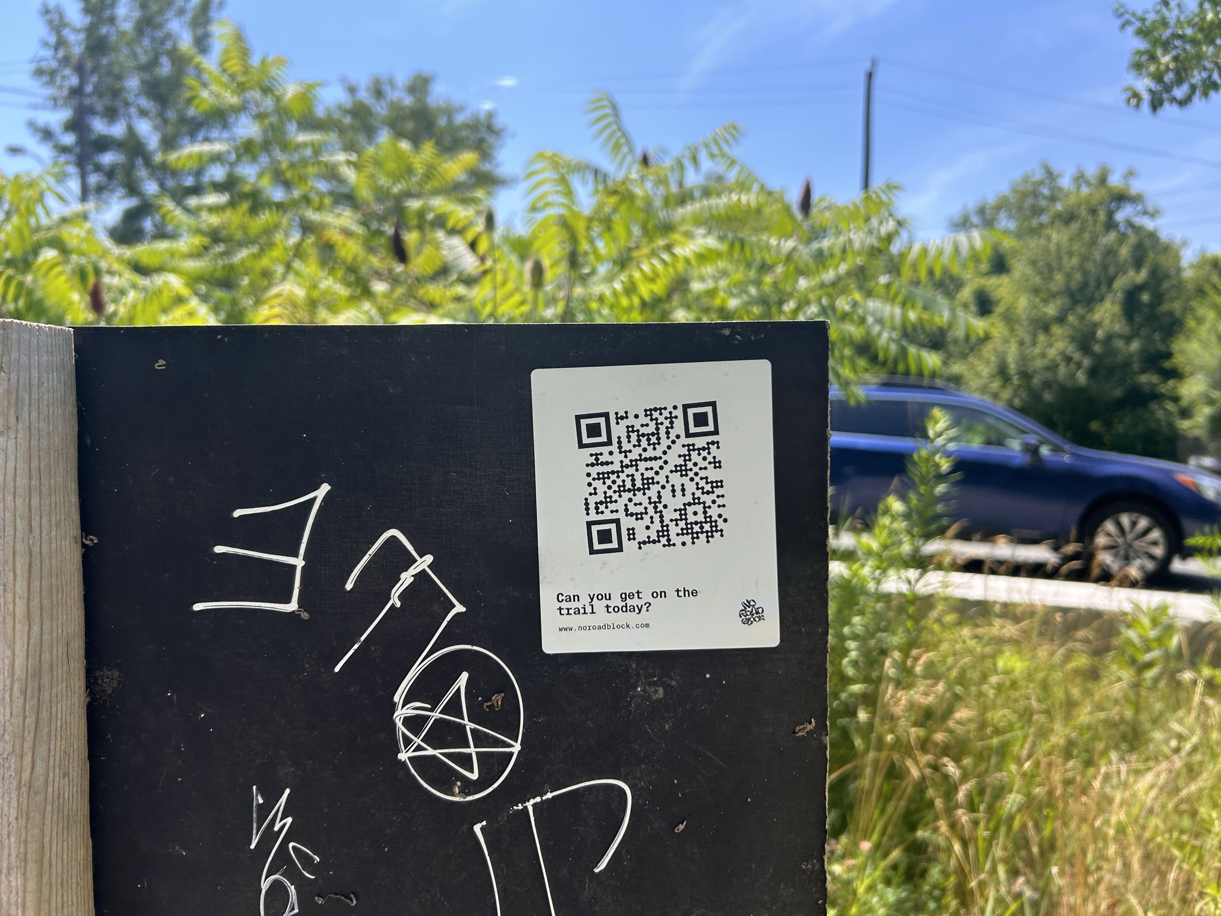
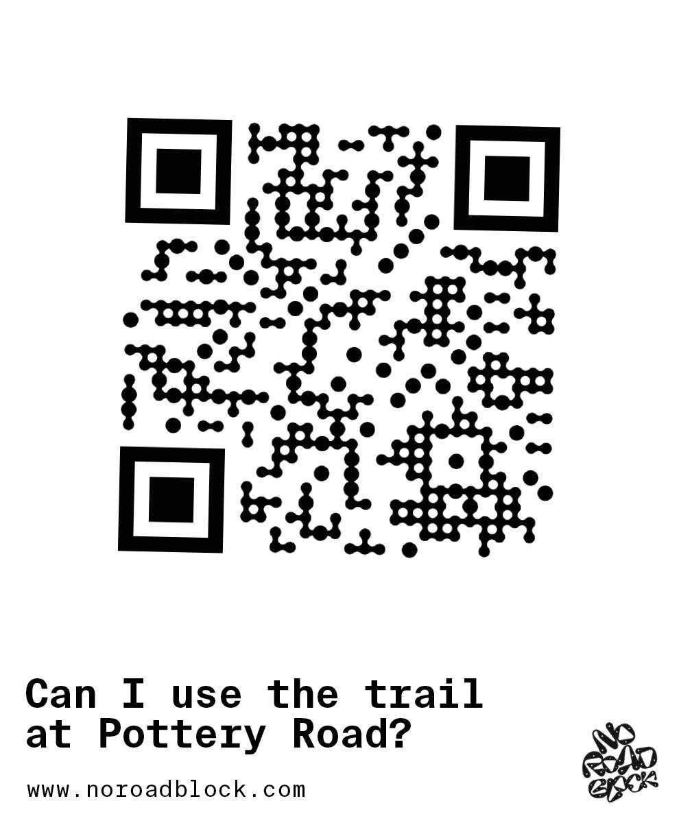
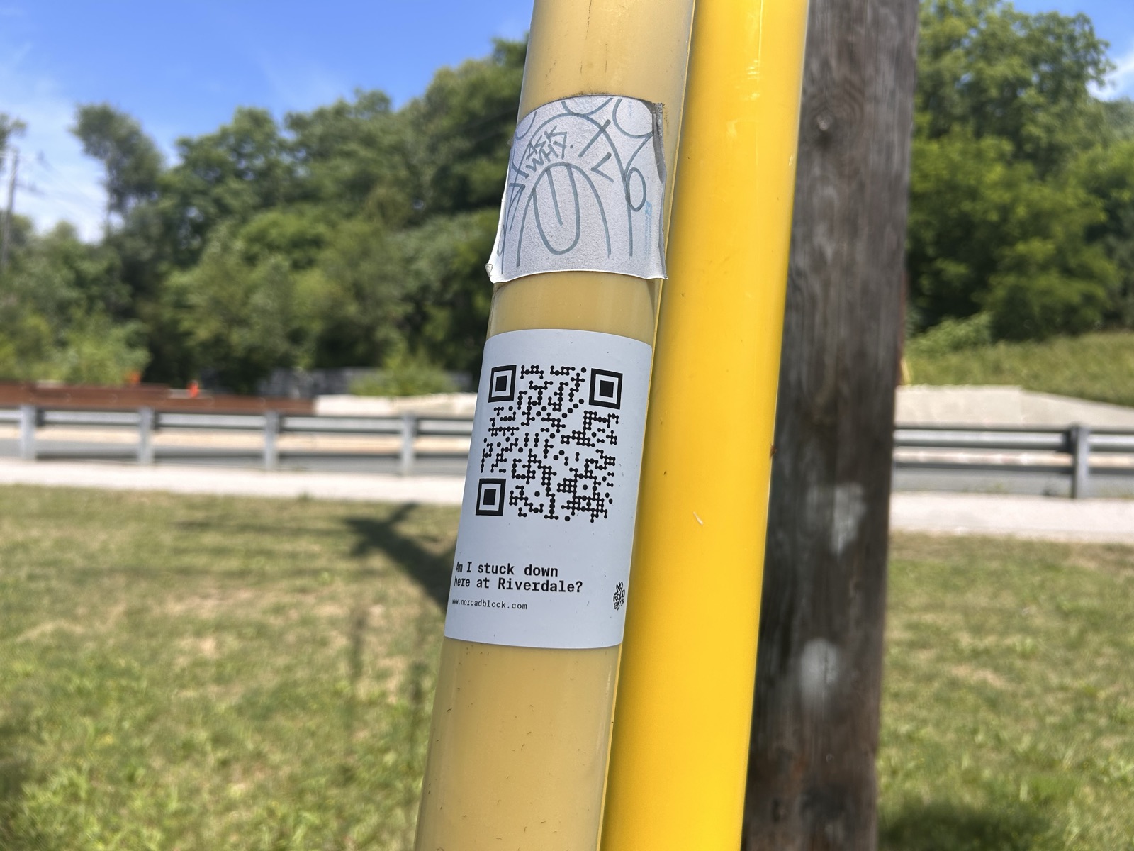
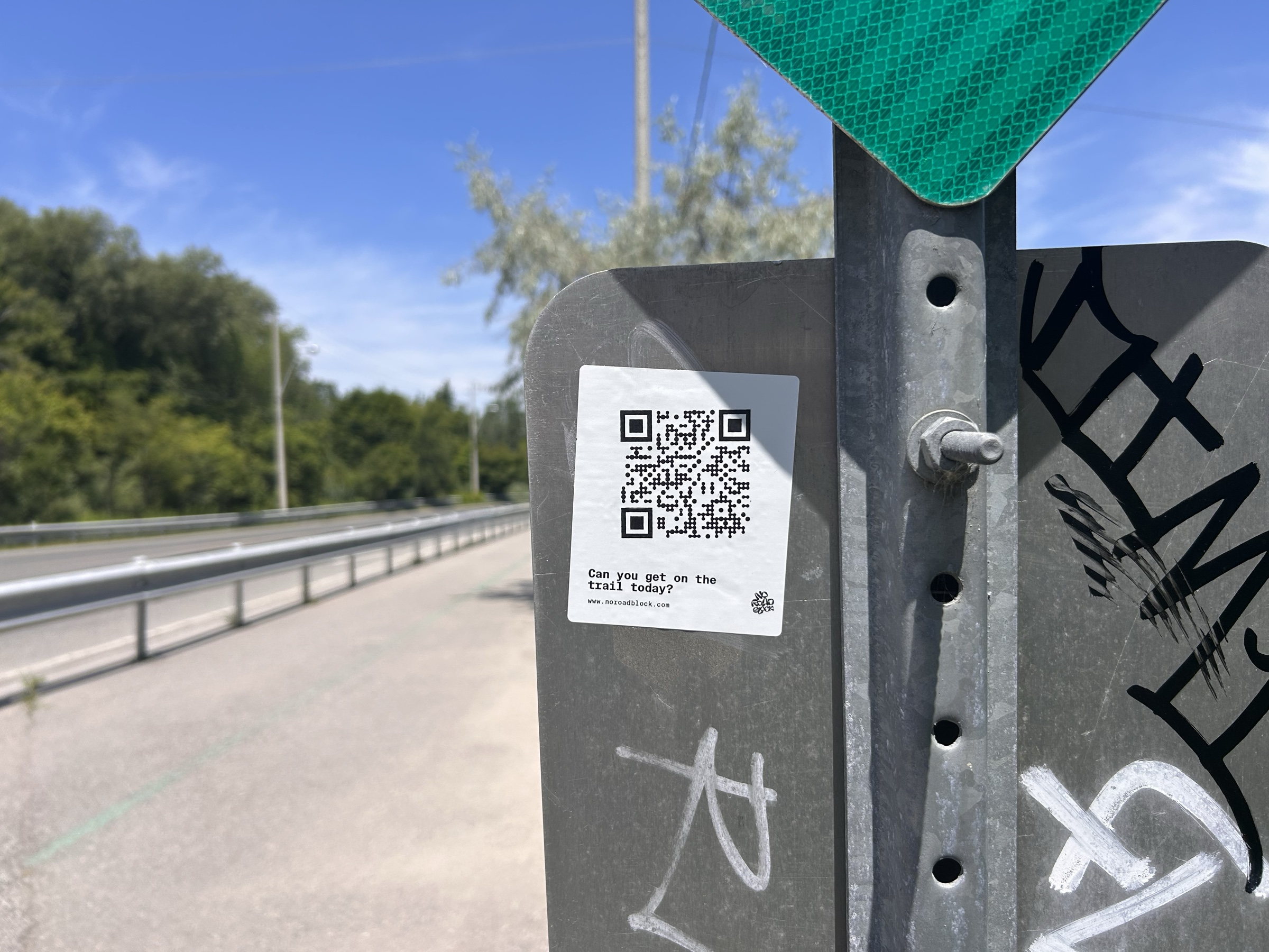
Research showed the moment of failure was standing at an entrance with no usable information. The product meets users exactly there: printed QR posters at each of the five access points link directly to that location's status page. The broken on-site signage that started this project became the distribution channel for its solution — each poster leads with the question a walker is already asking at that spot, in the product's own blue-on-paper voice.

QR poster asking 'Are the stairs finished?' with a large blue QR code and the line 'Update other trail users'

The QR poster for the Pottery Road access point — each location gets its own poster and its own question, linking straight to that spot's live status page. Design mockup: this QR code is not live.

A five-day production sprint

The build was a design project in its own right: five intensive days from validated concept to shipped site. That covered a new brand identity, a bespoke map theme with light and dark modes, the offline strategy, a serverless reporting backend with unit-tested aggregation logic, the QR print system, and the domain launch. The four weeks of research made that pace possible — every product decision already had an evidence base, so build time went into execution rather than debate.

Ruthless scope

Not everything from the prototype shipped — deliberately. Audio detour guidance tested well, but wayfinding turned out not to be this product's job; the reasoning lives in the accessibility section below. The core loop launched on its own: scan, see the status, report the status. Shipping the smallest thing that solves the researched problem beat shipping everything the prototype imagined.

Brand identity

Borrowing the visual language of the roadblock

The identity was designed inside the same five-day sprint as the product, and it borrows from the object that made the product necessary: temporary road signage. The letterforms are drawn by hand, each punched with the bolt holes of a roadside sign, and a pair of hand-drawn hazard badges — a rounded sign face and its exclamation mark — stamp the lockup the way warning stickers stamp a barricade.

The hazard badge — the identity reduced to a sign face and its exclamation. It anchors the lockup and works alone at small sizes.
Stacked wordmark — the signature on phone screens, as it appears on the live home page.
Horizontal lockup — for wide surfaces, the badges bracketing the name. The hero above makes the same stack-to-lockup swap as the live site.

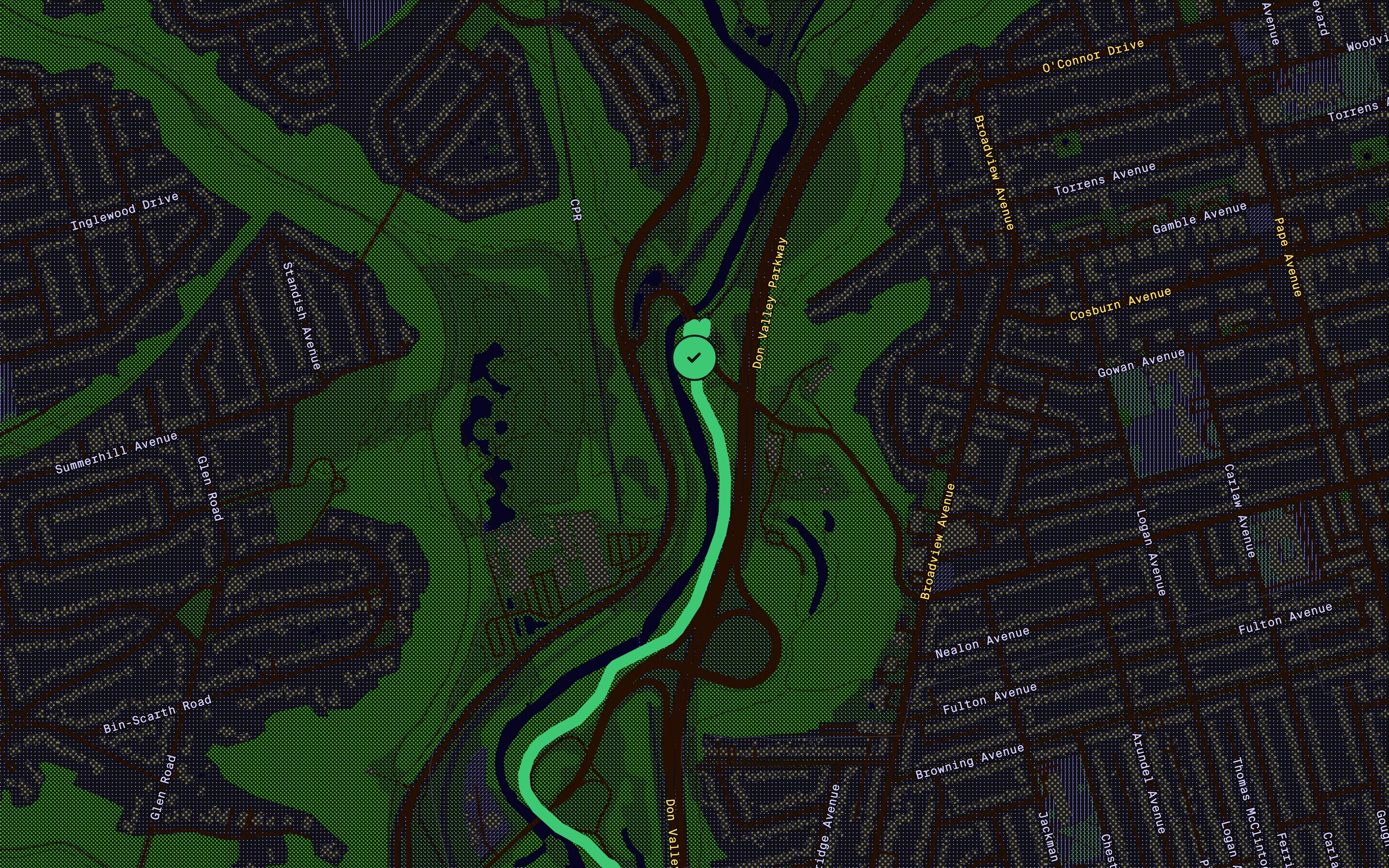
The system is deliberately narrow: one ink, one paper. Brand blue does every job — wordmark, trail, QR codes, map linework — over an off-white ground, following the same print logic as the map’s halftone screens and the dithered hero above. And dark mode isn’t a second design — the same identity reprinted in night ink, the marks flipping to paper.

The same Pottery Road map view in light and dark themes side by side: paper ground with halftone greens on the left, deep green night map with lit-window buildings and a pale green trail on the right

One paint file, two worlds. Every colour on the site and the map — chrome, statuses, dither screens — lives in a single tokens file, so dark mode is the same data wearing night ink: the halftone greens go deep, the river turns to black water, and the buildings become lit windows.

A brand built from the thing it replaces — the barricade’s own visual language, redrawn to answer the question the barricade never could.

No Road Block, live

A community-reported status site for the Lower Don

No Road Block launched in July 2026 at noroadblock.com. Scanning a poster drops you straight onto a full-viewport map of your access point, with live status markers for that stop and the next stops north and south — so a blocked entrance immediately shows you your alternatives. It's the prototype's detour-first thinking, rebuilt around live community data.

No Road Block location page for Pottery Road showing a clear status marker and three reports in the last 24 hours

The Pottery Road access point on the live site, with real reports from the last 24 hours. The custom map theme strips the base map back to what matters on foot: the river, the parkway, the green space, and the trail.

One tap to report

Reporting is deliberately smaller than the prototype's richest ideas: one question — what do you see at the barrier? — and three answers. Clear, on foot only, or blocked. No account, no app install, no free-text moderation burden. The interaction is sized for a muddy trailhead, not a desk.

No Road Block report sheet asking 'What do you see at the barrier?' with clear, on foot only, and blocked options

The report sheet on the live site. One question, three answers, one confirmation — reporting takes less time than reading a closure notice.

Designed for one bar of signal

The valley is a connectivity dead zone, so engineering choices were UX choices. The site is static, framework-free, and tiny, with self-hosted map tiles. When tiles can't load, the page falls back automatically to a pre-rendered static map; when the API is unreachable, it shows the phone's last-cached statuses. The research finding that users need answers at the trailhead — not at home — carried straight through to the architecture.

Desktop view of the No Road Block map showing the Lower Don trail corridor with a status marker at Pottery Road

The full trail on desktop. The same map serves both contexts: a quick pre-walk check at home, and on-trail status at the barrier.

Embracing the glitch

The map's halftone screens are drawn in device pixels, and a conventional smooth zoom smeared them into blur and moiré on every gesture — a glitch most products would spend effort hiding. This one promotes it. On every zoom the frame deliberately pixelates into a coarse mosaic, the map cuts and re-renders underneath while nothing legible is on screen, and the new view reassembles out of the pixels. The constraint wasn't worked around; it was turned up until it became the most interesting moment in the interface — the artefact as the aesthetic, in the same print logic as the halftones themselves.

Zoom in, zoom out, pull back to the whole trail — the rendering seam is the transition, not something it hides.

Trustworthy data without a database

Community data is only useful if it can be trusted. Reports are anonymous and rate-limited to one per person per spot every ten minutes, with no raw IPs stored. The majority of reports in the last 24 hours wins; older reports surface as stale rather than certain, and locations with nothing recent say so plainly. The whole backend runs on two serverless functions — nothing to maintain, nothing to fall out of date.

Accessibility considerations

Baked in, not bolted on

Accessibility was scoped from day one and carried through to production. In the prototype: optional audio directions and reduced screen reliance for low-vision users; non-colour signifiers and clear labels for colour-blind users; scannable copy, WCAG-compliant contrast, and mobility cues. On the live site: statuses communicated by label and icon as well as colour, light and dark themes that respect the system preference, and one-tap interactions that don't demand fine motor precision at a muddy trailhead.

The prototype's audio detour guidance didn't ship — deliberately. The sentiment from testing was consistent: the people who check trail status already know the trail and its access points well enough not to need turn-by-turn directions, and when they do want navigation they reach for Google Maps regardless. Audio was a stop-gap for a wayfinding problem other tools already solve well; the gap nobody else covers is live, on-the-ground status. The shipped product spends its effort there.

Future plans involve formal usability testing with low-vision participants and screen-reader analysis of the live site.

Audio instructions screen with playback controls and transcript

The prototype's audio directions screen — validated in testing, deliberately left out of the shipped product. Navigation belongs to the tools people already carry; live status is the job.

Learning & outcomes

Results, reflections & next steps

By the numbers

  • A live product at noroadblock.com covering 5 QR-coded access points
  • 5-day production sprint from validated concept to launched site
  • 12-second median time-to-detour validated in prototype testing
  • 3 taps to a usable detour in the prototype; 1 tap to report a status on the live site

What I delivered

  • Research synthesis across municipal notices and social posts; 1:1 user interviews
  • Information architecture, task and flow diagrams, and an interactive Figma prototype
  • A shipped web app: static, mobile-first frontend with a custom-themed interactive map and offline fallbacks
  • A serverless community-reporting backend with anonymous, rate-limited, unit-tested submissions
  • A brand identity and a QR poster system linking each physical access point to its live status page

What's next

  • Tag map sections with surface, grade, and width to support wheelchair routing and filters
  • Localise copy (EN/FR) and expand to additional Toronto ravine corridors
  • Run formal usability sessions with low-vision participants on the live site

Impact & reflection

Most case studies end at the prototype; this one didn't. Taking the work to production tested the research in a way no usability session could — and it held. The core findings (high-level statuses over detail, answers at the access point, familiar patterns over novel ones) all survived contact with real-world constraints, and the biggest product decision — flipping from municipal data to community reports — came directly from a research insight. The project sharpened the ability to scope ruthlessly, treat engineering constraints as design inputs, and carry a thread from first interview to shipped product.