Scroll

UX Case Study

Artpilot

Building a digital tool for the art world's workers.

Published 05/14/26

Artpilot is a six-week project to digitise art-service bookings across mobile and web. As the sole designer, I conducted research, prototyping, user testing, and branding. Two test rounds yielded a SUS 78 and 80% task completion in unmoderated studies.

Project brief

Understanding the context

Problem statement

Art services are still primarily booked by email and phone — a process that hides pricing from clients, leaves providers without the site details they need, and causes errors and delays on both sides.

Role and responsibilities

As the only designer, I owned every stage — research planning, interviews and surveys, flows, hi-fi prototypes, and both moderated and unmoderated testing. Working solo forced sharper prioritisation than a team would have, and kept the brand, system, and product decisions in one head.

Project goal

Replace ad-hoc scheduling with a single guided flow that surfaces pricing, scope, and site requirements before checkout — so clients and providers start the job already aligned.

Key challenges

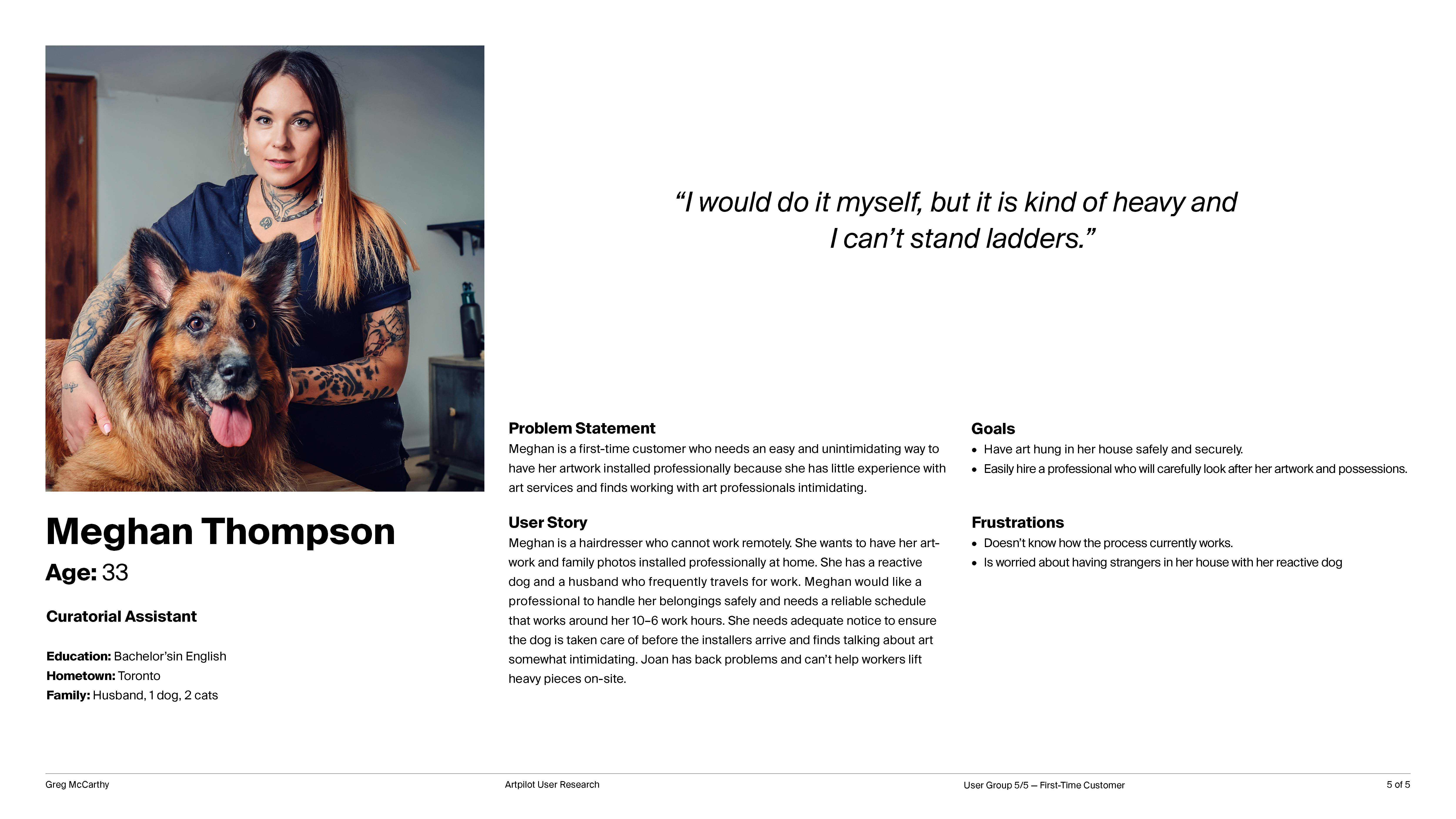
  • Removing intimidation for newcomers without alienating experts
  • Capturing complex job details early without overwhelming users
  • Replacing art-world jargon with plain, task-oriented language
  • Accounting for high-stakes, high-value transactions and their emotional weight

Project constraints

  • Timeline limited the scope of the hi-fi prototype to booking and inventory flows
  • Test participant in-person availability resulted in a higher reliance on unmoderated user testing

Empathising with users

From research to early prototypes

I mapped the key user groups Artpilot needed to serve:

  • Galleries and cultural institutions
  • Corporate collections (banks, law firms, universities etc.)
  • Artists / makers
  • Private collectors / residential clients
  • Art advisors

From there I conducted interviews, built personas, and understood the users' needs. Although many needs overlapped, there were distinct differences to address — particularly around technical language and the complexity of services required by each group. For example, most residential clients won't need to schedule a 50-artwork install, while a company moving offices certainly will.

Persona document showing user research findings

One of 5 personas developed to understand user needs and pain points.

After developing a low-fidelity prototype that explored auto-fill forms and a guided ordering flow modelled on consumer app patterns (similar to Uber Eats' ordering structure), early testing showed users were able to quickly order a service. Features designed for edge cases — such as booking on behalf of others — overlapped with the needs of art advisors and business clients.

Testing, feedback & iteration

Turning research insights into design outcomes

Testing was broken up across the process — starting with early tests to prove viability and proof of concept, then later to ensure high-fidelity prototypes weren't regressing the functionality validated in early stages. Three consistent themes emerged:

  • A need for more service clarity — interviews showed confusion over overlapping or art-world specific terms. Consolidating multiple order types into a single flow with plain language all but eliminated this confusion during testing.
  • Reframing install considerations — interviewees worried about complications such as stairs or oversized works, and felt that the language placed blame on them. Adding early scoping questions and rewriting the copy removed this sense of fault entirely.
  • Professionals' need for a desktop solution — gallerists and collection managers work primarily from desktop during office hours. This surfaced a need for a responsive website alongside the app.
78 Average SUS score across all iterative testing rounds.
80% 80% of unmoderated participants completed the intended flow.
100% 100% of participants preferred the prototype to existing tools.

These findings are directional — small sample sizes mean they cannot be treated as statistically robust. A study on a fully shipped product would yield more conclusive insights. Happy to share the full testing brief on request.

Refinements & design system

Designing app and web in parallel

Interviews with commercial users confirmed the need for a desktop experience alongside the app, so I designed a browser-based counterpart. Knowing this from the outset, I planned with responsiveness in mind from the start:

  • Creating variable tokens to allow faster component changes across screen sizes and modes
  • Coordinating component sizes — such as icon sets — with differing type scales
  • Building components with responsive structures over fixed measurements
  • Creating spacing systems designed to be used responsively

Front-loading these requirements sped up iteration and cross-component changes later, despite the initial setup cost.

Language is a design material. Swapping jargon for task-oriented labels meaningfully changed behaviour — users who had previously stalled at service selection completed the same step without hesitation once the labels were rewritten.
App home screen across several design iterations

The development of the app home screen (left to right) illustrates how functionality and design system refinement increased across iterations. Major improvements included removing bundled services in favour of à-la-carte selection, and merging the dashboard with the quick-access menu to reduce navigation depth.

Icon sizes for the base set standardised across 5 sizes, ensuring consistent layouts across different screen sizes.

Brand identity

Balancing institutional and inviting

Artpilot brings the rigour of a gallery to the user's door without the intimidation. The brand balances a friendly, approachable tone with the minimal aesthetic of the art world — deliberately avoiding a cold "white-cube" formality that can feel exclusive.

The typeface is Suisse by Swiss Typefaces — chosen for excellent readability, wide language support, and condensed styles that hold up where the brand has to work hardest: packaging, signage, uniforms, and shipping labels.

Mark — for app icons and small-format use where the brand is already established.
Wordmark — primary signature for digital surfaces and editorial.
Full lockup — applied to packaging, signage, and shipping artefacts.
01/ 02

The prototype

Placing an order with the app

Autofill, concise step summaries, and plain language keep typed input near zero. Most answers are pre-populated; users mainly confirm each step — emulating the experience of being guided by a skilled professional.

  1. App home
  2. New order
  3. Form, steps 1–5
  4. Confirmation

Booking an in-home installation, end to end. Autofill and step summaries keep typed input near zero.

Accessibility considerations

Designing for delegated and assisted use

The prototype lets users hand scheduling and payment to a caregiver, family member, or assistant as part of the order itself — built into the flow rather than bolted on. The same affordance covers anyone who can't reasonably interact with technicians on arrival: people who need translation, or who can't point out artwork locations themselves.

Standards-wise, all text meets WCAG AA contrast, touch targets are a minimum 48px, and typographic guidelines are documented in the design system for future contributors.

Card elevation states for low-vision users

Card elevation states provide visual differentiation for low-vision users, reducing reliance on colour alone to communicate hierarchy.

Learning & outcomes

Results, reflections & next steps

By the numbers

  • System Usability Scale score of 78 — above average
  • 80% of unmoderated participants completed the intended flow
  • 100% participant preference over existing service models

Delivered

  • High-fidelity app prototypes for booking, order review, and confirmation
  • Browser-based counterpart for desktop users
  • Light brand identity applied across UI, motion, and mockups

Next steps

  • AR consult flow for remote condition reporting and frame mock-ups
  • Full inventory management for large collections
  • AI-assisted service recommendation
  • Expanded accessibility for delegated and assisted access scenarios